
Author
Pixels Mark
Release
Intensity
20 MIN READ
A strong photography business card tells someone who you are, what you photograph and where they can see your work — within a few seconds of picking it up. It should include your studio name or professional name, your photography specialty, a clear portfolio path and an email address. Every element should connect to your wider visual identity. One clear QR code, used purposefully, adds value. A cluttered card with too many contact options does the opposite.
What Should a Photography Business Card Communicate?
A business card is a physical extension of your studio brand. It is not a brochure or a services menu. The goal is simple: give someone enough information to remember who you are and know exactly how to find your work.
Apply the Three-Second Card Test: if a person picks up your card and cannot identify your name, your photography specialty and the next step to see your work within a few seconds, the card is doing too much or too little.
The front should establish identity. The back should support it — with a portfolio path, a QR code or a curated image, depending on your brand direction. Both sides should feel like they belong to the same studio.
If your photography logo is still in development, building a consistent photography identity before committing to printed cards will save money and produce better results. If you are deciding how to create that identity, our logo maker vs custom design comparison covers when each route makes sense for a photography business.
Choose a Style That Fits Your Photography Brand
Not every card direction suits every photographer. The most important decision is not which finish to use — it is which visual direction honestly represents your work and the clients you want to attract.
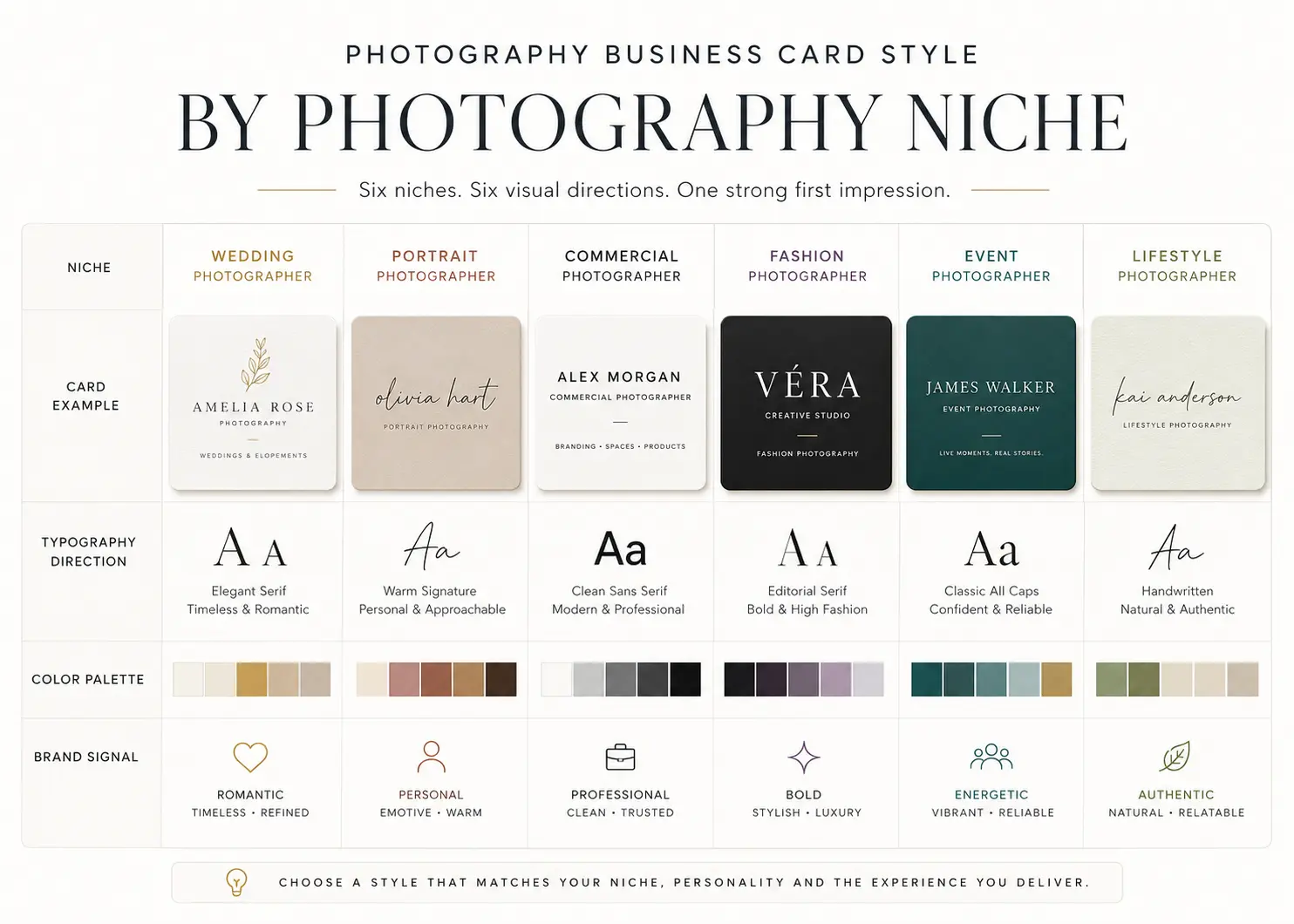
| Photography business | Recommended direction | Brand signal |
|---|---|---|
| Wedding photographer | Editorial serif, tactile stock, restrained image | Romantic and refined |
| Portrait studio | Warm palette, personal wordmark, clean layout | Personal and welcoming |
| Commercial studio | Minimal sans serif, strong hierarchy | Clear and credible |
| Fashion photographer | Bold typography, high contrast | Editorial and confident |
| Event photographer | Clear service and QR portfolio | Accessible and action-oriented |
| Destination photographer | Compact personal brand and mobile portfolio | Flexible and memorable |
25 Photography Business Card Ideas
Minimal Ideas (1–6)
1. Editorial serif wordmark. The studio name in a refined serif typeface, set large on a white or off-white card. No image, no icon. The typography does the work. Best for: fine art and wedding photographers with a confident name. Brand signal: precise, considered, established. Caution: the typeface selection matters significantly — a weak serif undercuts the concept. Finish: uncoated or soft touch.
2. Black-and-white studio card. High-contrast black on white or white on black, no photographic element. A strong sans-serif name with one keyword descriptor below it. Best for: commercial and editorial photographers. Brand signal: modern and professional. Caution: avoid combining black backgrounds with very fine reversed type. Finish: matte or uncoated.
3. Monogram-first card. A two or three-letter monogram mark on the front with full studio details on the reverse. Best for: established studios with a recognisable identity. Brand signal: craft and longevity. Caution: the monogram must work at small sizes. Finish: blind debossing or foil on a monogram front can be very effective when used with restraint.
4. White-space portfolio card. Mostly empty space with studio name, specialty and portfolio URL. Nothing else. Best for: photographers who have built enough profile that their name carries weight. Brand signal: confidence and clarity. Caution: only works when the URL destination is well designed and loads quickly on mobile.
5. Initials plus specialty. Large initials in a geometric or serif mark, with a single line below stating the photography specialty. Best for: solo photographers building a personal brand. Brand signal: direct and personal. Finish: uncoated or recycled stock reinforces an approachable editorial feel.
6. Horizontal clean-line card. Studio name and contact details arranged in a single clean horizontal band across the lower third. Rest of the card is open. Best for: portrait and lifestyle studios. Brand signal: calm and considered. Caution: the typeface and spacing need to be precise — poor spacing in a minimal layout is immediately visible.
Photo-Led Ideas (7–11)
7. Full-bleed signature image. One strong photograph covers the full front of the card. Studio name and URL appear in a clean typeface over the image or on the reverse. Best for: photographers whose work has a highly consistent and recognisable visual style. Apply the Portfolio Consistency Rule: use a photograph only when that image represents the type of work you consistently want to sell. Caution: the image must remain legible at card size. Finish: matte or soft touch typically allows the image to breathe better than a gloss coating.
8. Split image and contact layout. One half of the card is a strong image panel; the other half contains contact details on a neutral ground. Best for: wedding and portrait photographers. Brand signal: visual and practical. Caution: the image panel and the text panel must share colour and typographic language or the card reads as two separate designs.
9. Single-image reverse. Logo-led front with full-bleed portfolio image on the reverse. Best for: photographers who want a professional front for agency and vendor contacts but a visual reminder of their work on the reverse. Brand signal: versatile and professional.
10. Curated two-image grid. Two related images occupying the card front, either side by side or top and bottom. Best for: photographers with a coherent paired portfolio aesthetic. Caution: avoid images with different colour grades, moods or subjects — inconsistency is amplified at card size.
11. Studio colour-block plus image. A dominant studio brand colour occupies one third of the front; the remaining space is a photographic panel. Contact on reverse. Best for: portrait studios building a distinctive colour identity. Brand signal: bold and consistent.
Typography-Led Ideas (12–15)
12. Signature-style card. The photographer's own name styled as a signature or refined handwritten treatment, with supporting details in a clean secondary typeface. Best for: personal-brand photographers and wedding specialists. Brand signal: approachable and personal. Caution: signature scripts can be difficult to read at small sizes. Test on a print proof before ordering a full run. The best photography watermark fonts often also work well at signature-card scale.
13. Bold sans-serif identity. Studio name in a strong, contemporary sans-serif at large scale. Minimal additional detail. Best for: commercial photographers and creative studios. Brand signal: direct and confident. Finish: spot gloss on the name against a matte background creates a tactile contrast without requiring foil.
14. Serif and sans-serif pairing. Studio name in a refined serif; descriptor and contact in a complementary geometric sans-serif. Best for: portrait and wedding studios who want warmth alongside professionalism. Brand signal: considered and credible. Caution: the pairing must be deliberate — mixing two decorative faces creates visual noise.
15. All-caps wordmark card. Studio name set in widely tracked capital letters across the full width of the card. Best for: commercial and fashion photographers. Brand signal: editorial authority. Caution: this direction relies entirely on spacing and typeface quality — cheap type at tight tracking reads as a template, not a brand.
Tactile and Finish-Led Ideas (16–19)
16. Blind-debossed cotton card. A heavyweight cotton-fibre card with the studio mark pressed in without ink. Best for: fine art and portrait studios whose clients value physical craftsmanship. Brand signal: quiet confidence. Apply the Print Restraint Rule: a premium finish should reinforce the identity, not compensate for weak typography or layout. Caution: fine detail in the mark may be lost — use a simple, bold form.
17. Restrained foil accent. A single foil element — the studio initial, a dividing line or the URL — on an otherwise typographic card. Best for: wedding and boutique studios. Brand signal: refined without excess. Caution: avoid combining foil with busy imagery. The card should be near-empty before the foil is added.
18. Soft-touch dark card. A very dark charcoal or navy card with soft-touch coating and a light typographic treatment. Best for: fashion and commercial studios. Brand signal: sophisticated and contemporary. Caution: soft-touch coatings can show handling marks over time, so request a physical sample before approving the final stock.
19. Uncoated natural stock. A warm, natural uncoated paper with a serif or handcrafted wordmark and minimal colour. Best for: portrait, lifestyle and family studios. Brand signal: honest and tactile. Caution: ink may appear softer on uncoated stock — test colours on a press proof before the final print run.
Modern Connected Ideas (20–22)
20. QR portfolio card. A clean typographic front with a single QR code on the reverse linking to a curated portfolio gallery. Apply the One-Destination QR Rule: a QR code should support one clear action and lead to one focused destination. Best for: commercial and event photographers. Brand signal: practical and current. Caution: the linked page must be fast, mobile-optimised and updated.
21. QR booking card. Studio name and specialty on front; QR code linking directly to a booking page on reverse with a clear label. Best for: portrait studios and event photographers with a high booking volume. Brand signal: efficient and professional.
22. Minimal contact card. Name, specialty, email and URL only. No image, no icon, no QR code. Best for: photographers who network regularly and want a card that does not date quickly. Brand signal: assured and permanent. Caution: this direction fails if the URL is difficult to type or the portfolio is not current.
Niche-Specific Ideas (23–25)
23. Wedding editorial card. An editorial serif wordmark with a restrained typographic layout, printed on a tactile stock. A small image of one signature wedding photograph can appear on the reverse. Best for: wedding photographers targeting venue partnerships and planner referrals. Brand signal: romantic, credible, experienced.
24. Portrait appointment card. Clean personal wordmark on front. Appointment confirmation prompt or booking link on reverse. Best for: portrait studios with a consultation or booking-first model. Brand signal: professional and welcoming.
25. Commercial credential card. Geometric or neutral sans-serif name and specialty. Agency-facing hierarchy: studio name, discipline, email, portfolio. No decorative elements. Best for: commercial and editorial photographers pitching to creative agencies and brands. Brand signal: serious and qualified. See also the best photography logo ideas for guidance on logo directions that support commercial credibility.
Does Your Photography Logo Work at Card Size?
Create Your Photography LogoSVG & PNG Download • No Account Required
Photo or Logo? How to Choose
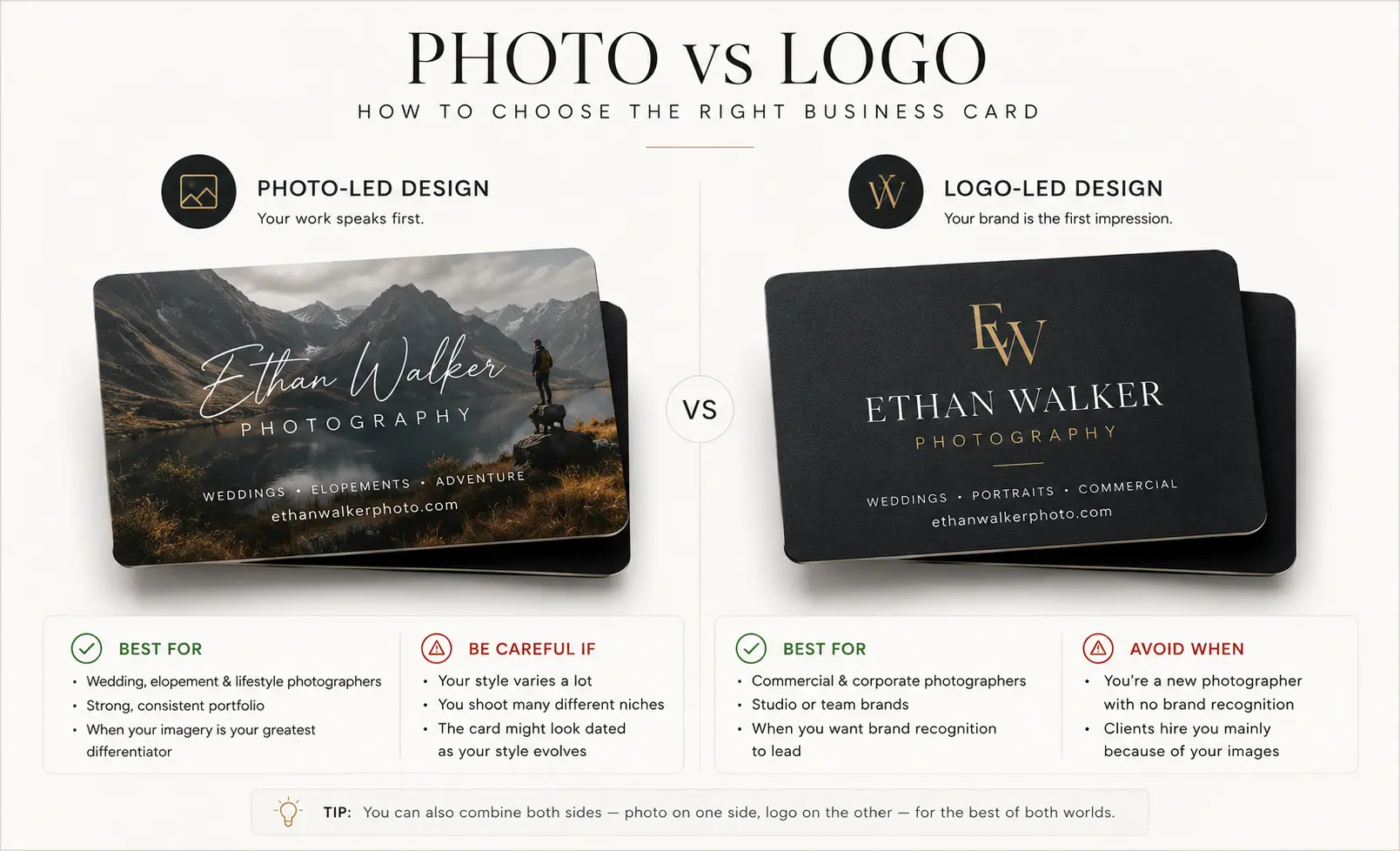
This is the question most photographers spend too long on. The answer is conditional rather than decorative.
| Use a photograph when | Use a logo-led card when |
|---|---|
| One image accurately represents the work you consistently want more of | You work across several photography genres |
| Your visual style is highly consistent across all work | Commercial credibility matters more than emotional appeal |
| The image crops well and remains clear at card size | Your portfolio changes frequently |
| The image will not date quickly | Your logo or wordmark is the stronger identifier |
For many photographers, a logo-led front with a carefully chosen image on the reverse offers the strongest balance: professional and credible in agency and vendor situations, visually compelling when the card is turned over.
What Information Should Appear on a Photography Business Card?
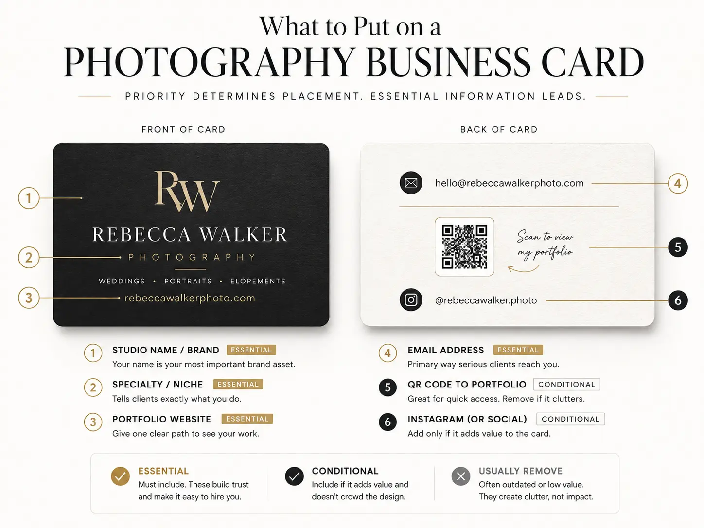
| Information | Priority | Reason |
|---|---|---|
| Studio name or professional name | Essential | Identity |
| Photography specialty | Essential | Clarifies the service immediately |
| Portfolio URL | Essential | Shows the work |
| Email address | Essential | Primary contact path |
| Phone number | Conditional | Useful for direct booking; omit if enquiries come through the website |
| Instagram handle | Conditional | Useful when social discovery is central to the studio model |
| QR code | Conditional | Creates one fast action; only add if the destination is current and mobile-optimised |
| Full postal address | Usually remove | Adds clutter and is rarely needed for a mobile photography business |
| Multiple social platforms | Usually remove | Dilutes the primary contact path |
| Long service list | Usually remove | Belongs on the website, not on the card |
Typography and Colour
Typography is the element most photographers underestimate on a business card. The typeface communicates before anyone reads a word.
| Photography niche | Typography direction |
|---|---|
| Wedding | Editorial serif with a clean complementary sans-serif |
| Portrait | Warm serif or personal wordmark |
| Commercial | Geometric or neutral sans-serif |
| Fashion | Bold, high-contrast contemporary type |
| Fine art | Restrained serif or a quiet minimal wordmark |
Colour should be drawn from the existing studio identity. If the website and social profiles use a specific palette, the business card should match it — not approximately, but exactly. A card that reads as a slightly different shade of the same colour still breaks consistency.
If the studio brand colours are still being defined, the photography logo ideas guide covers colour direction by photography niche in more detail.
QR Codes
A QR code on a photography business card is only useful when it takes the viewer somewhere specific and relevant. The One-Destination QR Rule: one QR code, one clear action, one focused destination.
| Goal | QR destination |
|---|---|
| Show work | A curated portfolio gallery |
| Generate enquiries | A contact or enquiry form |
| Book sessions | A booking page |
| Share contact details | A digital business card or contact page |
| Promote one service | A niche-specific landing page |
Never link to a generic homepage that requires the viewer to navigate from the beginning. Always test the QR code from a printed sample before ordering in quantity.
Paper Stocks and Print Finishes
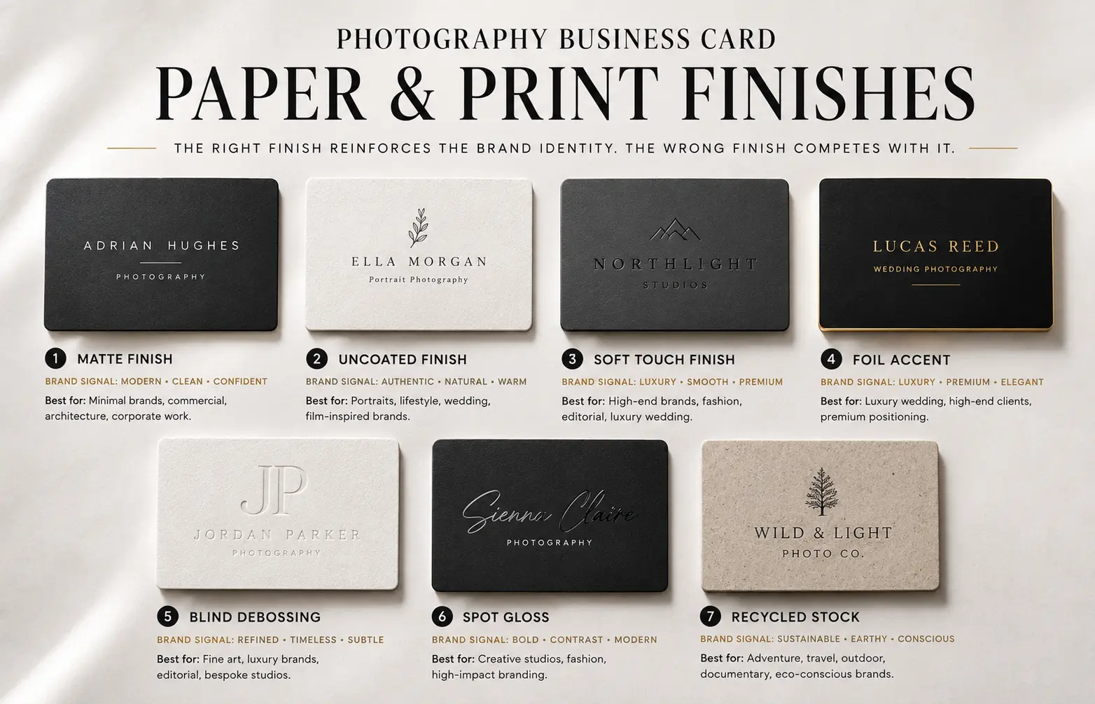
| Finish | Brand signal | Best for | Caution |
|---|---|---|---|
| Matte | Clean and versatile | Most studios | Can feel generic without strong design |
| Uncoated | Tactile and natural | Portrait and lifestyle | Colours may print more softly |
| Soft touch | Smooth and polished | Commercial and fashion | Can show handling marks over time |
| Foil accent | Refined and celebratory | Wedding and boutique studios | Use sparingly on otherwise simple cards |
| Blind debossing | Quiet craftsmanship | Fine art and portrait | Fine mark detail may be lost |
| Spot gloss | Modern visual contrast | Commercial and editorial | Requires suitable flat artwork |
| Recycled stock | Natural and considered | Lifestyle and conscious brands | Paper texture may affect image detail |
The Print Restraint Rule applies here. A sophisticated finish should reinforce a well-designed card — it cannot rescue a weak one. Choose the finish last, after the layout, typography and colour are resolved.
Print Preparation
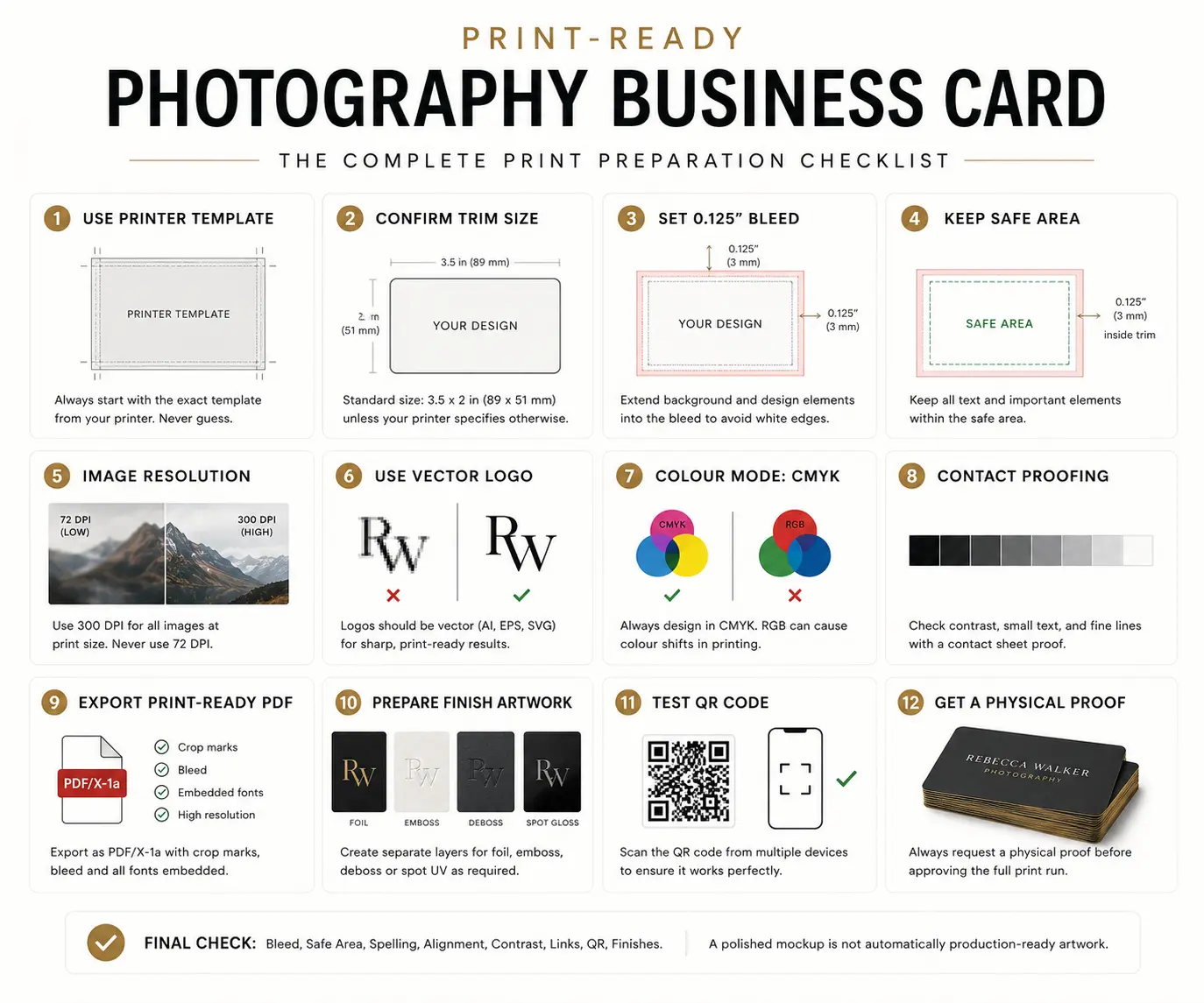
A polished mockup on screen is not automatically production-ready artwork. These are the practical steps that separate a professional print file from a file that will cause problems at the print stage.
- Download the printer's template — do not guess at dimensions.
- Confirm the trim size. A common size is 85 × 55 mm or 3.5 × 2 inches, but print suppliers vary. Always use the supplier's confirmed specification.
- Add the required bleed. A common bleed is 3 mm or 0.125 inches on each edge, but always follow the printer's exact template.
- Keep all text and logos inside the safe area specified by the supplier.
- Use high-resolution photographs — print providers typically require 300 PPI at print size, though requirements can vary.
- Use a vector logo where possible. Rasterised logos at card size can produce soft edges. The PNG vs SVG vs JPG format guide explains when and why vector formats matter for print.
- Check colour requirements. Print providers may require CMYK, and RGB files can shift significantly in conversion. Confirm with the supplier before preparing artwork.
- Proof every contact detail. Typos in a URL, email or phone number cannot be corrected after printing.
- Export in the file format the printer requests, typically a press-ready PDF. Settings vary by supplier.
- Scan the QR code from a printed proof before approving a large order.
- Order a physical proof copy before the full print run.
Expert tip: Test the card at actual printed size before sending to the supplier. Open the design file, set the print scale to 100% and print on a standard office printer. This single step catches type that is too small to read, images that become muddy at scale and layouts that looked balanced on screen but not in hand.
Common Mistakes
- Using a generic camera icon rather than a studio mark or wordmark.
- Listing too many services — the card should point to the website, not replicate it.
- Setting decorative or script typography at a size that becomes unreadable at card scale.
- Adding multiple social media handles when one portfolio URL does the same job better.
- Including a photograph that does not represent the work the photographer wants to sell.
- Linking the QR code to a generic homepage rather than a specific, relevant destination.
- Treating black and gold as automatic signals of quality — the combination depends entirely on execution.
- Ignoring bleed and safe-area requirements, which results in trimming through text or a white border around full-bleed designs.
- Using a low-resolution version of the logo that was saved for web rather than print.
- Designing the card in visual isolation from the website, portfolio and other brand materials.
- Ordering a large quantity without proofing a physical sample first.
Illustrative Example
Illustrative example only. No real studio, outcome or client is represented.
A Sydney portrait studio offering calm, appointment-led family and individual sessions considers two card directions: a full-bleed photograph of a recent portrait, or a clean wordmark card in a warm neutral with the studio name and booking URL.
The portrait option carries risk: a photograph taken this year may no longer represent the studio's preferred style in two years, and a single image cannot cover both family and individual portrait work equally. The wordmark option ages better, matches the clean aesthetic of the studio's website and works equally well whether the client contact is a family booking a session or a local business commissioning corporate headshots.
The studio adds a single QR code on the reverse linking directly to the portfolio gallery, with soft-touch coating on the front and an uncoated matte reverse. The QR page is tested on a printed proof before the final order.
Decision Checklist
- Does the visual direction match your photography niche and target clients?
- Can someone identify your specialty within a few seconds?
- Is the logo or studio name readable at actual printed size?
- Is the portfolio path obvious and easy to reach?
- Does the card match your website, portfolio and watermark?
- If a photograph is included, does it represent the work you consistently want more of?
- Does the QR code support one clear action and lead to one focused destination?
- Is the finish reinforcing the brand rather than trying to compensate for a weak design?
- Have you followed the printer's exact specifications?
- Have you tested a physical printed proof before committing to a full order?
Frequently Asked Questions
Do photographers still need business cards?
It depends on the studio model. Cards remain useful at in-person networking events, venue meetings, wedding fairs and client consultations. They are less relevant for photographers who generate all enquiries through social media or direct referrals. The question is not whether cards are modern — it is whether your clients and contacts will encounter them in a context where a physical card is more useful than a phone exchange.
What should a photographer put on a business card?
The essential details are the studio name or professional name, photography specialty, portfolio URL and email address. Phone, Instagram and a QR code are conditional — include them only when they serve a clear purpose. Everything else, including long service lists, postal addresses and multiple social links, typically adds clutter without adding value.
Should a photographer include a photograph on the business card?
Only when one image accurately represents the style of work the photographer consistently wants to sell. A logo-led card with a portfolio URL serves most photographers more reliably because it does not date quickly, works across multiple genres and maintains consistent quality regardless of which season's work is strongest. For photographers with a very distinctive visual style and a highly consistent portfolio, a photograph can be a strong differentiator.
Should a photography business card have a QR code?
A QR code is useful when it takes the viewer somewhere specific and relevant. If it links to a mobile-optimised portfolio or booking page, it adds clear value. If it links to a generic homepage or an outdated page, it creates a poor impression. Test the destination on a physical proof before printing the final quantity.
What should the QR code link to?
One clear destination that serves the most likely action of the person receiving the card. For most photographers, this is a curated portfolio gallery or a contact and booking page. Avoid linking to a social feed, a generic homepage or a page that requires further navigation before the work is visible.
What is the best paper finish for a photography business card?
There is no single answer — the right finish depends on the studio identity and the client context. Uncoated or soft-touch stock suits portrait and lifestyle studios. Matte is versatile across most niches. Foil accents work for wedding and boutique studios when used sparingly. Avoid choosing a finish before the design is resolved. The finish should reinforce a strong card, not attempt to save a weak one.
Should the card be horizontal or vertical?
Horizontal is the standard orientation and suits most photographers because it aligns with how cards are typically stored and exchanged. Vertical layouts can be distinctive when the design logic supports them — a strong typographic column or a tall portrait image, for example. Choose the orientation that the design calls for, not the one that feels different for its own sake.
What file should be sent to the printer?
Most print providers request a press-ready PDF with bleed, crop marks and the colour profile they specify. Some suppliers have their own export presets. Always follow the specific printer's requirements rather than assuming a standard applies. If the card includes a vector logo, embed it or outline the fonts before exporting. A physical proof is worth ordering before committing to a full print run.
Photography Business Card Summary
- Apply the Three-Second Card Test: the viewer should identify your name, specialty and portfolio path within a few seconds.
- Choose a visual direction that fits your photography niche and target clients — not one that simply looks attractive in isolation.
- Use a photograph only when one image accurately represents the style of work you want to sell and will not date quickly.
- Include only essential information: studio name, specialty, portfolio URL and email. Everything else is conditional.
- A QR code should support one clear action and lead to one focused destination — always test it on a physical proof.
- Choose the print finish last, after the layout, typography and colour are resolved. A finish cannot rescue a weak design.
- Always use the printer's template and order a physical proof before committing to a full quantity.
- The card should feel like a small part of the same visual system as the website, portfolio and watermark — not a standalone piece.
Related Articles
- Best Photography Logo Ideas
- Photography Logo Design Tips
- Best Photography Watermark Fonts
- PNG vs SVG vs JPG Format Guide
References
The following sources support the technical print guidance in this article.
- MOO — Standard Business Card Sizes
- Vistaprint — What Is Bleed in Printing
- Adobe — Exporting PDF for Print
- Canva — CMYK vs RGB for Print
Build the Identity Behind Your Business Card
Create Your Photography LogoNeed a complete studio identity? Explore Custom Brand Identity Services