
Author
Pixels Mark
Release
Intensity
12 MIN READ
Your watermark travels with every image you share. Most photographers spend time getting the design right but pick the first font that looks good on screen. A few weeks later, that watermark is invisible on dark photos, unreadable at small sizes, or just does not look like it belongs to a professional brand.
Font choice is not a small decision. It shapes how clients perceive your work before they even read your name. This guide covers the best photography watermark fonts, how to choose the right one for your niche, and the mistakes that make watermarks look amateur even when everything else is right.
No Credit Card Required SVG & PNG Download Free
Why Your Watermark Font Matters
A watermark does two jobs at once. It protects your image from unauthorized use, and it builds your brand every time someone sees your work. The font you use determines how well it does both.
A font that is too decorative becomes unreadable at small sizes. A font that is too generic looks like a default setting rather than a considered brand decision. A font that does not match your photography style creates a disconnect between your work and your identity.
Think about a luxury wedding photographer using a bold condensed sans-serif for their watermark. The font itself sends the wrong signal before a single image is viewed. The right font communicates who you are without needing to say anything.
For a broader look at how watermark design decisions affect your brand, our guide on watermark logo ideas covers design principles alongside font choices.
Best Font Styles for Photography Watermarks
Different photography niches call for different visual languages. Here is how the main font categories map across the most common photography markets.
Script Fonts (Signature Style)
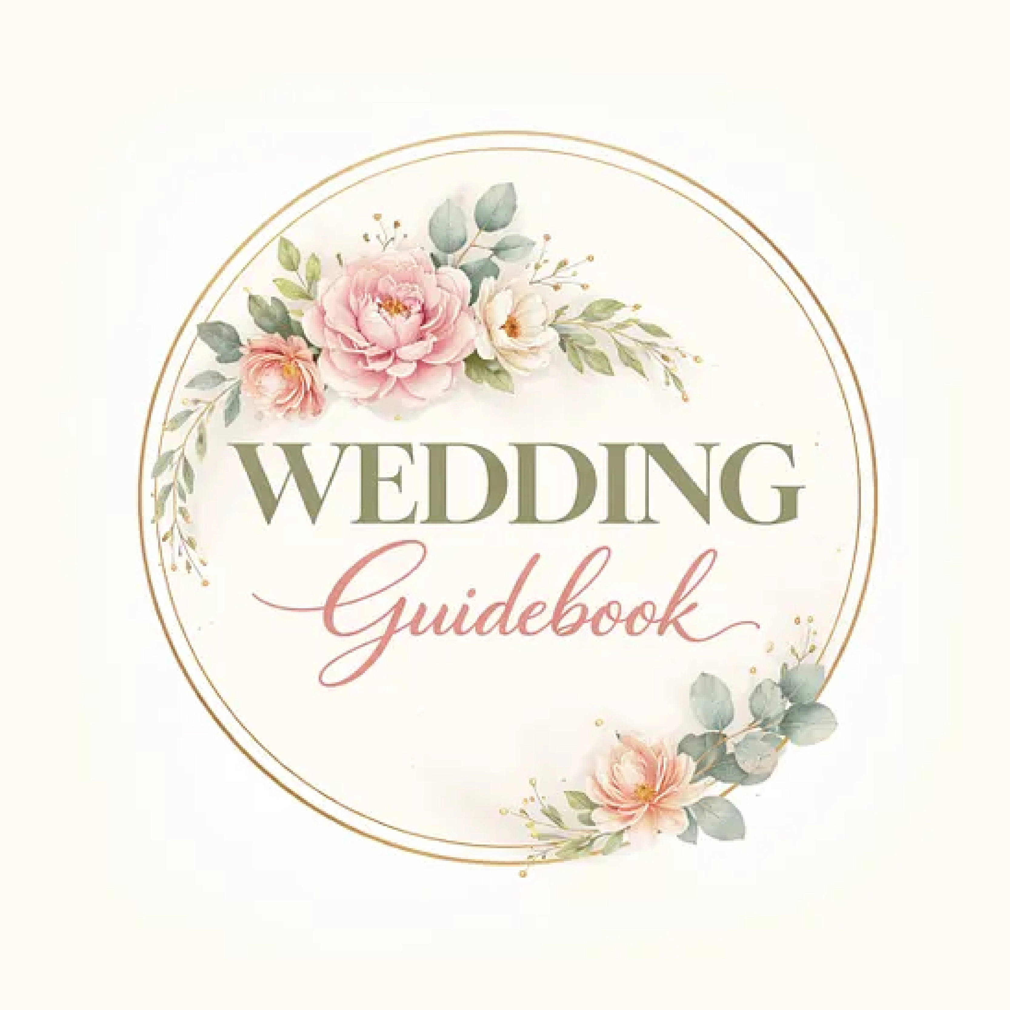
Script fonts use flowing, connected letterforms that mimic handwriting. They are the most personal option available and work particularly well for photographers who lead with their individual identity.
- Best for: Wedding photographers, portrait photographers, lifestyle photographers
- Why they work: Script fonts feel warm and human. They communicate that there is a real person behind the camera, not a faceless studio. When a bride shares her wedding gallery with family, a script watermark reinforces the personal connection that made her choose you in the first place.
- Real examples to consider: Cormorant Garamond Italic, Playfair Display Italic, Great Vibes, Pacifico
- What to watch: Thin script fonts look elegant at large sizes but disappear as watermarks. Choose scripts with consistent stroke weight that hold up when scaled down to 150 pixels wide.
Script fonts are genuinely the best choice for wedding photographers, but only when the stroke weight is consistent. A thin script that looks beautiful at large sizes will disappear completely as a watermark on a busy background.
Serif Fonts
Serif fonts have small decorative strokes at the ends of letterforms. They carry associations with heritage, precision, and premium quality, which makes them well-suited to photographers working in elevated markets.
- Best for: Fine art photographers, fashion photographers, high-end portrait photographers
- Why they work: Serifs communicate that the work behind the watermark is considered and craft-driven. They feel timeless rather than trendy, which matters for photographers whose work is meant to last.
- Real examples to consider: Garamond, Freight Text, Libre Baskerville, Lora
- What to watch: Very thin serifs lose legibility on complex backgrounds. Test at small sizes before committing.
Sans-Serif Fonts
Sans-serif fonts have clean lines with no decorative strokes. They are modern, minimal, and highly legible at small sizes, which makes them one of the most practical choices for watermark use.
- Best for: Commercial photographers, drone photographers, product photographers, editorial photographers
- Why they work: Clean typography signals precision and professionalism. For photographers whose clients are businesses rather than individuals, a geometric sans-serif communicates technical authority.
- Real examples to consider: Montserrat, Futura, Proxima Nova, Inter, Raleway
- What to watch: Very light weights (100, 200) lose visibility against busy backgrounds. Use regular or medium weight for watermark applications.
Minimal and Monogram Fonts
Monogram-style approaches use initials rather than full names. They are compact, work cleanly at very small sizes, and look more designed than a simple text watermark.
- Best for: Personal brand photographers, studio brands, photographers whose full name is long
- Why they work: A well-designed monogram reads as a logo mark rather than just a name label. It occupies less space on the image while still building brand recognition over time.
- Real examples to consider: Any clean serif or geometric sans-serif works for monograms. The letter arrangement and spacing matter more than the specific font.

How to Choose the Right Watermark Font
The right font depends on three things: your photography niche, your existing brand identity, and how the font behaves at small sizes.
- Readability first. Before anything else, test every font at 150 pixels wide. That is roughly how small your watermark appears on a shared social media image. If the font still reads clearly at that size, it can work as a watermark font.
- Match your brand. If your website uses clean serif typography, a casual script watermark will feel disconnected. Your watermark should look like it belongs to the same visual identity as everything else.
- Font size and spacing. Watermarks should take up no more than 10 to 15 percent of the image width. Add letter-spacing of around 0.05 to 0.1 em, as slightly wider spacing improves legibility at reduced opacity.
- Opacity range. Set opacity between 30 and 50 percent for most watermark applications. Test over both a light image and a dark image before settling on a final opacity.
- Placement. Bottom right and bottom center are the most common watermark positions. Choose one and apply it consistently across every image you share publicly.
For a full step-by-step guide on building your watermark from the ground up, our guide on how to make a photography watermark covers every practical decision in plain language.
Best Font Pairing Ideas for Watermarks
Some watermarks combine two fonts, usually a name in one style and a title or tagline in another. Here is what works.
- Script + Sans-Serif: The most popular pairing for personal brand photographers. A flowing script name paired with a clean sans-serif studio name or URL creates contrast between the personal and the professional. Keep the script larger and the sans-serif smaller.
- Serif + Minimal: A refined serif for the full name paired with a monogram or minimal mark creates a premium feel. Works well for fine art and fashion photographers who want something considered without being decorative.
- Single font with weight variation: One font family used at two weights, a medium weight for the name and a light weight for a secondary detail. This creates visual hierarchy without mixing styles, which is often cleaner than combining two separate fonts.
Common Watermark Font Mistakes to Avoid
These are the patterns that consistently separate professional-looking watermarks from generic ones.
The most common mistake is choosing a font based on how it looks in a logo mockup, not how it reads at 100 pixels wide over a real photograph. Test at actual watermark size first, every time. It makes all the difference.
- Using overly complex fonts. Highly decorative scripts look impressive in logo mockups but fall apart as watermarks. Intricate letterforms lose legibility when scaled down and placed over complex image backgrounds.
- Low readability at small sizes. The font that looks perfect at 500 pixels wide becomes unreadable at 100 pixels. Always test at the actual size your watermark will appear on a social media share before committing.
- Wrong opacity. A watermark at 80 percent opacity dominates the image and damages the viewing experience. A watermark at 15 percent disappears on mid-tone backgrounds. The 30 to 50 percent range is where most watermarks should sit.
- Oversized watermark. A watermark that covers 30 percent of the image signals insecurity rather than professionalism. Keep it subtle, consistent, and in a corner where it does not compete with the subject.
- Mixing too many fonts. Two fonts maximum for any watermark. Three or more creates visual noise that undermines the professional impression you are trying to build.
For more real examples of what professional watermarks actually look like across different photography niches, our collection of photography watermark examples covers 25 professional approaches with practical commentary.
How to Apply Watermark Fonts Step by Step
Once you have chosen your font, here is how to apply it across the main tools photographers use.
- 1.Lightroom:: Go to File, Export, then scroll to the Watermarking section. Choose Text Watermark, type your name, select your font from the dropdown, and set opacity and position. This applies automatically to every exported image in a batch.
- 2.Photoshop:: Create a new layer, add your text using the Type tool, select your font and size, set the layer opacity to your chosen percentage, and save as a transparent PNG for reuse across other editing tools.
- 3.Canva:: Create a new project, add a text element, choose your font, export as PNG with transparent background enabled. The free tier limits export options, so check before starting.
- 4.Pixelsmark:: The fastest option if you want a properly designed watermark logo rather than just a text overlay. Enter your name, select a photography-specific style, and download a transparent PNG and SVG immediately. The fonts and layouts are designed specifically for photographers, which removes most of the decision-making.

If you are still comparing the free tools available, our breakdown of free photography watermark tools covers every major option with a practical comparison.
Why a Custom Logo Watermark is Better Than a Text Font
Choosing a font and typing your name is a starting point. A custom logo watermark is a different thing entirely.
A text watermark tells people your name. A custom logo watermark communicates your name and your brand identity simultaneously. The difference is visible every time your image gets shared.
Every photographer using the same default fonts has a watermark that looks like every other photographer using those same fonts. A custom logo built around your photography niche and visual identity is distinctive. It builds recognition over time rather than blending into the background.
The practical side is also straightforward. A properly designed logo watermark is delivered in vector format, which means it scales cleanly to any size. It includes both light and dark versions for different image backgrounds. And it exports in transparent PNG and SVG formats that work across every editing tool photographers actually use.
For photographers who want to go straight to building, Pixelsmark is completely free, requires no design experience, and produces photography-specific results rather than generic business templates.
Comparison Table
| Option | Ease of Use | Font Control | Export Formats | Best For |
|---|---|---|---|---|
| Pixelsmark | Very Easy | Built-in photography fonts | PNG, SVG, transparent | Custom watermark logos |
| Canva | Easy | Large library, manual setup | PNG (limited free) | Beginners |
| Lightroom | Medium | Basic text only | JPEG with watermark | Batch export workflows |
| Photoshop | Advanced | Full control | Any format | Advanced customization |
Frequently Asked Questions
What is the best font for a photography watermark?
It depends on your niche. Wedding and portrait photographers do well with script fonts like Cormorant Garamond Italic or Great Vibes. Commercial and drone photographers should use clean geometric sans-serifs like Montserrat or Futura. Fine art photographers tend toward classic serifs. Whatever you choose, test it at 150 pixels wide before committing.
What font should I use for a watermark?
Match the font to your brand and photography style. If your website uses a clean sans-serif, use that same family for your watermark. If you photograph weddings and your brand is warm and personal, a refined script font suits your niche. The key is consistency between your watermark and the rest of your visual identity.
What opacity should a watermark be?
Between 30 and 50 percent for most applications. Test your watermark over a light image and a dark image at your chosen opacity before finalizing it. A watermark that disappears on one or shows too strongly on the other needs a different opacity or a second version.
Can I use signature fonts for a watermark?
Yes, and they work very well for wedding, portrait, and lifestyle photographers. The key is choosing a script with consistent stroke weight that holds up at small sizes. Avoid very thin or highly ornamental scripts that lose legibility when the watermark is scaled down to appear on a social media share.
How big should a watermark font be?
Your watermark should take up no more than 10 to 15 percent of the image width. In practical terms, for a 3000 pixel wide image, your watermark text should be around 60 to 100 pixels tall. Export your watermark file at 2000 pixels wide minimum and scale it down when applying to images.
Conclusion
Font choice is one of the smallest decisions in photography watermarking and one of the most visible. The right font is legible at small sizes, consistent with your brand, and appropriate for the clients you want to attract.
Start by testing your shortlisted fonts at actual watermark size. If it reads clearly, matches your visual identity, and holds up on both light and dark images, it works. If not, simplify it.
For photographers who want to move beyond a text overlay and build a watermark that actually represents their brand, gives you photography-specific logo designs with proper export formats, completely free.
References
- Adobe: Typography and Brand Identity Best Practices (adobe.com)
- Canva Design School: Choosing Fonts for Branding (canva.com)
- Professional Photographers of America: Building a Photography Brand (ppa.com)
- Google Fonts: Open Source Font Library (fonts.google.com)