
Author
Pixels Mark
Release
Intensity
22 MIN READ
No Credit Card Required • SVG & PNG Download Free
Hair is personal. So is the salon where someone chooses to sit in the chair. That relationship starts before a client ever books an appointment, and in most cases it starts with how your brand looks online.
A well-designed hair salon logo communicates what kind of experience clients can expect. It tells them whether your salon is a luxury blowout bar, a neighbourhood studio, an editorial-focused colour specialist, or a natural hair care practice. That information travels in the shape of a font, a color choice, and a mark, before anyone reads a single word.
Most salon owners invest heavily in their interior and their craft, then rush the logo. The result is a brand that does not match the experience, and clients notice the gap even when they cannot name it.
This guide covers 25 hair salon logo ideas across five style directions, along with color palettes, typography, icon guidance and the branding decisions that consistently separate salons that build loyal followings from those that get lost in a crowded market.
Why Your Hair Salon Logo Matters
The hair industry is competitive at every price point. Clients in most cities have dozens of salon options within a short distance, and they make decisions based on what they see online before they ever visit in person. Your logo is the first visual signal they encounter and it does significant work before any conversation begins.
- Instagram and social profiles: Your profile image is your logo. If it is cluttered, unreadable, or looks like a stock template, potential clients move on before reading a single post.
- Google Business Profile: Your logo appears beside your salon name in search results and on Maps. A clean, considered mark communicates legitimacy before a review is read.
- Booking pages: The moment a client clicks through to book, your logo sets the visual standard for the experience. A generic mark raises doubt. A considered one builds confidence.
- Signage and physical presence: Your logo on a window, a door, or a street sign is a first impression for every person who walks past. It should be legible from a distance and distinctive enough to remember.
- Packaging and aftercare: If your salon retails products or sends clients home with branded materials, your logo on packaging communicates that care extends beyond the appointment.
A hair salon logo is not decoration. It is the first thing a potential client uses to decide whether your salon matches what they are looking for. Every design decision either builds or undermines that first impression.
25 Hair Salon Logo Ideas for 2026
Different salons serve different markets and carry different personalities. Here are twenty-five logo directions organized across five style categories that consistently work in the hair industry.
| Logo Style | Best For | Colors | Font Style |
|---|---|---|---|
| Luxury | Premium salons and blow-dry bars | Black and gold, deep plum | Serif, monogram |
| Minimalist | Modern studios, design-conscious clients | White and nude, sage | Geometric sans-serif |
| Feminine | Boutique salons, personal brand stylists | Blush and gold, rose gold | Script, italic serif |
| Editorial | Trendy salons, urban markets | Black and white, charcoal | Condensed sans-serif |
| Natural | Organic hair care, wellness studios | Sage and ivory, warm brown | Serif, minimal script |
Luxury Hair Salon Logo Ideas
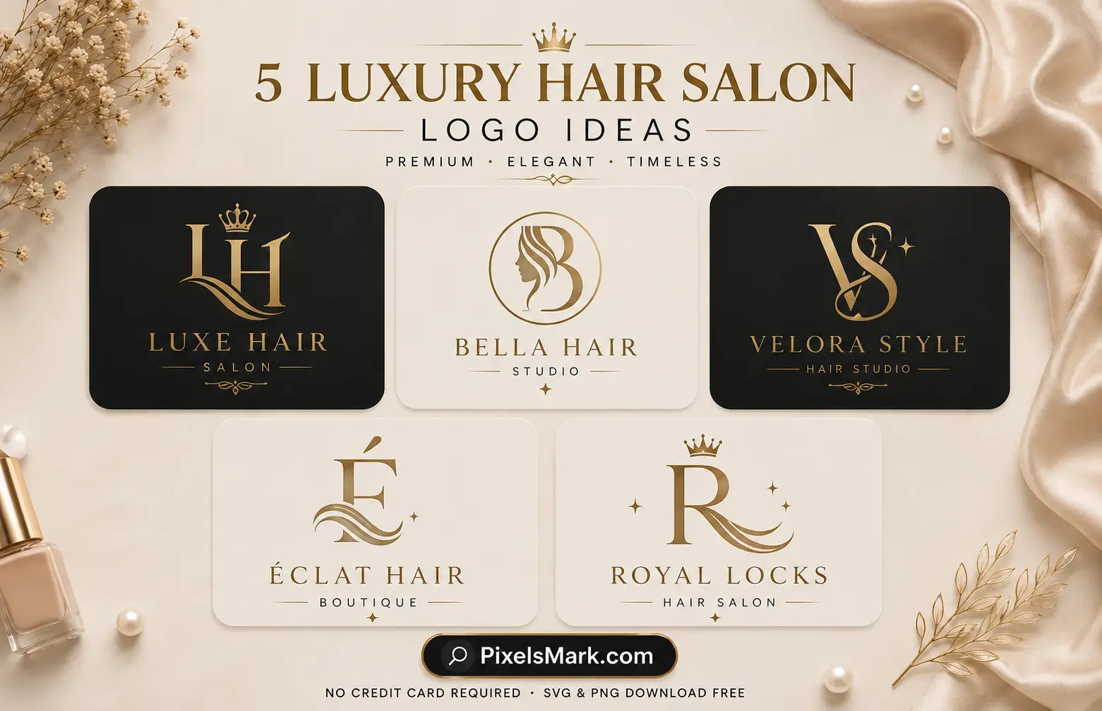
- 1. Gold serif wordmark on dark background. The salon name in a refined serif font set in gold or cream against deep charcoal or black. Signals premium positioning before a single word is read. Best for high-end salons, blow-dry bars, and luxury styling studios targeting clients who expect a premium experience.
- 2. Interlocking monogram initials. Two or three salon initials arranged so they share strokes or overlap slightly. Feels crafted rather than assembled. Travels well across business cards, packaging, signage, and social profiles. Best for established luxury salons with strong personal brand identity.
- 3. Stacked name with wide letter-spacing. The full salon name set in generous tracking above a thin descriptor such as Hair Studio or Colour Specialists. The spacing communicates confidence. Best for salons positioning at the upper end of the market and targeting style-conscious clients.
- 4. Initial inside a thin oval or rectangle. A single serif initial contained within a delicate geometric border. Communicates heritage and precision in a compact mark that works at any size. Best for salons with a strong individual identity and an established local reputation.
- 5. Thin crown or arch above the name. A minimal arch or crown element reduced to a few clean lines, positioned above a refined wordmark. Communicates prestige without being overdone. Best for salons using luxury or appointment-only positioning.
Minimalist Hair Salon Logo Ideas
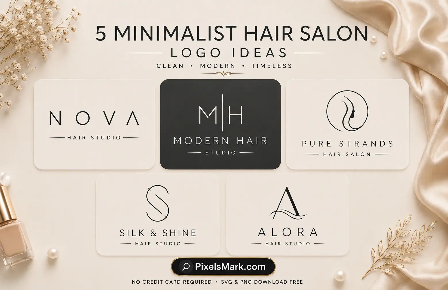
- 6. Single weight wordmark. The salon name in a clean geometric sans-serif at one consistent stroke weight. No marks, no icons, no decoration. The restraint itself communicates confidence. Best for modern salons targeting younger, design-conscious clients in competitive urban markets.
- 7. Monoline abstract mark. A single continuous line forming a simplified hair wave, scissors abstraction, or flowing shape. Abstract enough to feel designed rather than clipart. Best for contemporary salons and independent stylists who want a mark that travels across all digital platforms.
- 8. Circle initial mark. A single initial inside a thin circle. Compact, reads clearly at any size, and works as a profile image, watermark, and packaging stamp simultaneously. Best for personal brand stylists who need one flexible mark across multiple platforms.
- 9. Two-letter monogram, no border. Two initials set at equal weight with generous space between them. No border, no added elements. The discipline of the design communicates brand confidence. Best for boutique salons and stylists whose personal reputation is central to the business.
- 10. Negative space mark. A hair or beauty-adjacent shape created through negative space inside a simple geometric form. Sophisticated and memorable without complexity. Best for salons that want something visually considered without illustrative detail.
Elegant and Feminine Hair Salon Logo Ideas
- 11. Flowing script name. The salon name in a refined script that reads like a personal signature. Warm, approachable, and immediately communicates that a real person is behind the brand. Best for personal brand stylists and boutique salons building trust-led client relationships.
- 12. Script name with thin botanical accent. A script wordmark paired with a single minimal leaf, blossom, or branch element. Communicates natural beauty and organic care without being heavy or literal. Best for natural hair care salons and wellness-focused studios.
- 13. Italic serif with decorative underline. A salon name in an italic serif with a thin line beneath. Feels editorial and considered rather than decorative. Best for established salons that want to communicate expertise and longevity alongside warmth.
- 14. Script inside a thin oval border. The salon name in flowing script contained within a delicate oval frame. Compact, reads as premium without relying on color, and works well on packaging and appointment cards. Best for feminine boutique salons and colour studios.
- 15. Name with small floral or butterfly accent. A refined name with a minimal blossom or butterfly positioned near a letter. Communicates transformation and natural beauty. Best for salons using wellness or nature-forward positioning.
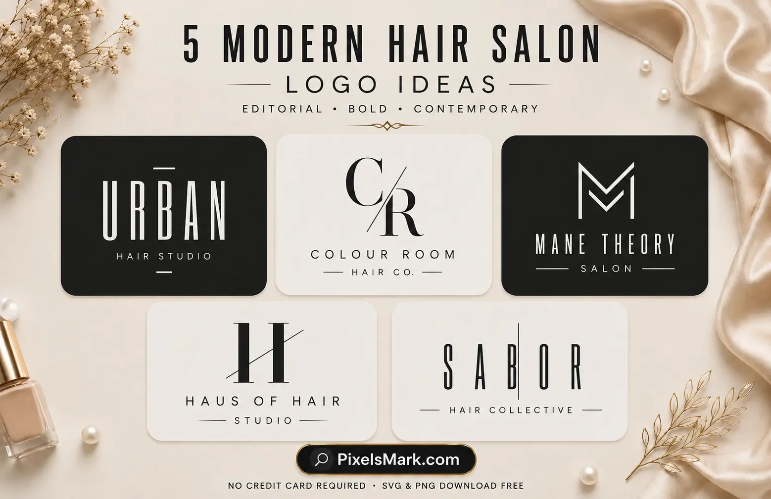
- 16. Bold condensed wordmark. Salon name in a bold condensed sans-serif, all caps or title case. Communicates commercial confidence and editorial authority. Best for salons in urban markets targeting fashion-forward clients and editorial-adjacent positioning.
- 17. Split letter mark. A single letter split by a thin horizontal or vertical line, creating subtle visual tension. Contemporary and distinctive. Best for design-forward salons that want a mark with an editorial rather than traditional feel.
- 18. Wide-tracked typographic mark with descriptor. Full salon name in a wide-tracked sans-serif above a smaller italic descriptor. Creates a clear visual hierarchy that reads at every size. Best for full-service salons and colour studios with multiple service categories.
- 19. Abstract geometric mark. A circle, triangle, or simple line intersection used as a primary brand mark beside the salon name. Abstract enough to be versatile across contexts and distinctive enough to build recognition over time. Best for modern wellness studios and multi-service salons.
- 20. Asymmetric typographic layout. The salon name set asymmetrically, with a larger bold first word and a lighter smaller second word. Creates visual energy while remaining fully readable. Best for contemporary salons with a strong brand personality and a design-conscious clientele.
Hair Salon Logos by Niche
- 21. Colour specialist studio. A clean wordmark in a refined sans-serif paired with a minimal abstract mark that suggests colour mixing or gradient. Best for balayage and colour-focused studios where the technical service is the primary differentiator.
- 22. Natural and textured hair salon. A botanical mark, a leaf or curl abstracted to minimal geometry, paired with a warm serif or script name. Communicates care for natural hair textures and organic products. Best for salons specializing in curly, coily, and textured hair care.
- 23. Blow-dry bar. A light, contemporary wordmark in a clean geometric sans-serif. No heavy icons. The focus is on speed, consistency, and style. Best for blow-dry bars and express styling studios targeting busy urban clients.
- 24. Independent mobile stylist. A personal name in a refined script with a compact mark that works clearly on a business card and as a phone screen profile image. Mobile stylists need logos that work without a physical location to anchor them. Best for freelance and home-visit hair stylists.
- 25. Bridal hair specialist. A refined script name beneath a minimal arch or delicate floral element. Warm, ceremonial, and occasion-appropriate. Best for stylists and studios specializing in bridal and event hair styling.
The Psychology Behind Hair Salon Logo Design
Every color, font, and shape in a hair salon logo carries associations that potential clients process before they consciously engage with your brand. Understanding what those signals communicate helps you make deliberate choices rather than aesthetic ones.
- Gold communicates luxury and aspiration. A gold element in a hair salon logo signals that the experience matches the quality of the brand. It attracts clients who are already prepared to invest in premium services.
- Black communicates confidence and editorial authority. A black-based logo positions a salon alongside fashion and lifestyle brands rather than within traditional beauty conventions. It works for salons that want to feel current and design-led.
- Blush and warm tones communicate femininity and warmth. These colors build approachability and personal trust. They work well for personal brand stylists and boutique salons where the client relationship is central to the business model.
- Sage and botanical tones communicate wellness. These palettes attract clients who see hair care as part of a broader wellbeing practice. They work consistently for natural hair care salons and organic product-focused studios.
- White and nude communicate precision and cleanliness. These palettes signal that the salon prioritizes skill and consistency. They work well for blow-dry bars and express styling studios where speed and quality are the primary selling points.
- Script fonts communicate personal trust. A script or handwritten font tells clients there is a real person behind the brand who takes personal responsibility for the experience. They build the relationship-based trust that drives repeat bookings.
- Geometric and sans-serif fonts communicate technical skill. Clean, structured typography signals expertise and attention to detail. These fonts work for colour specialists, extension technicians, and salons where technical service is the primary offering.
Best Colors for Hair Salon Logos
Color communicates your positioning before a client reads your name. In the hair industry, palette choices carry specific associations that experienced salon brands use deliberately.
- Black and gold. The most consistent combination in luxury hair salon branding. Black communicates editorial confidence and gold signals premium quality. Works across signage, digital profiles, and packaging without losing impact.
- Blush and rose gold. Warm, feminine, and aspirational. Works well for boutique salons and personal brand stylists targeting clients who want a warm, personal relationship with their stylist.
- White and nude. Clean, precise, and increasingly popular as clients respond to brands that feel considered and skin-first. Works consistently for blow-dry bars and natural hair care salons.
- Deep brown and ivory. Warm, natural, and grounded. Communicates that the salon understands and respects hair health alongside aesthetics. Works well for textured hair specialists and natural care studios.
- Sage and warm ivory. Growing consistently in the beauty industry as clients seek brands that feel organic and wellness-oriented. Works for natural hair care salons positioning around hair health rather than trend.
- Charcoal and white. Clean, modern, and confident without the weight of full black. Works for contemporary urban salons targeting a broad demographic with a focus on quality and consistency.
Always test your color palette in black and white before finalizing. A logo that only works in color has a structural problem. The underlying design should communicate clearly in monochrome, and color should reinforce rather than carry the brand.
Best Fonts for Hair Salon Logos
Font choice determines whether your salon brand feels premium, approachable, modern, or generic. The wrong font undermines everything else the design achieves.
- Script fonts for warmth and personal identity. Cormorant Garamond Italic, Great Vibes, and Playfair Display Italic communicate that a real person is behind the brand. Test any script font at Instagram profile size before committing. Thin scripts that look beautiful at full size often become unreadable at 150 pixels wide, which is where most clients will first encounter your logo.
- Serif fonts for luxury and authority. Playfair Display, Cormorant Garamond, and similar serifs communicate quality, heritage, and craftsmanship. These work well for established salons and luxury styling studios that want to feel authoritative rather than personal.
- Geometric sans-serif for modern clarity. Montserrat, Raleway, and Poppins read clearly at any size and communicate clean confidence. These pair well with minimal abstract marks and suit contemporary salons targeting design-conscious clients.
- Condensed sans-serif for editorial strength. Bebas Neue, Oswald, and similar condensed fonts communicate commercial confidence and work well for urban salons targeting fashion-forward and editorial-adjacent clients.
Font pairing works best when one font carries warmth and the other carries structure. A script name above a clean sans-serif descriptor creates a hierarchy that reads clearly at every size and in every context. Avoid pairing two decorative fonts. The result is visual noise rather than hierarchy.
Best Icons for Hair Salon Logos
Icon choice is where many hair salon logos go wrong. The most common mistake is reaching for a literal symbol, a detailed pair of scissors, a comb, or a hair dryer, that communicates template output rather than a considered brand.
- Abstract scissor line. A scissors shape reduced to its essential line form, two crossing lines or a minimal V shape. Abstract enough to feel designed rather than clipart. Works well at small sizes and across all digital applications.
- Monoline hair wave or curl. A single curved line suggesting the movement of hair. Abstract enough to read as a mark rather than an illustration. Particularly effective for natural hair care and curl-specialist salons.
- Botanical elements. A leaf, single petal, or minimal branch communicates natural care and organic positioning. Works consistently for natural and textured hair salons positioning around hair health.
- Monogram or initial mark. A refined initial or set of initials often outperforms any illustrative icon for hair salon branding. It communicates personal craft and scales clearly from a small profile image to large signage.
- Geometric marks. A circle, diamond, or simple line arrangement used as a primary mark. Abstract and versatile. Works across every context without relying on beauty iconography.
Avoid detailed scissors illustrations, realistic hair dryers, and comb clipart. These are among the most overused elements in salon logo design and communicate that the brand has not been considered regardless of how skilled the stylist actually is.
No Credit Card Required • SVG & PNG Download Free
Hair Salon Logo Mistakes to Avoid
- Using clipart-style beauty icons. Detailed scissors, combs, and hair dryer illustrations are the most common mistakes in hair salon logo design. They communicate template rather than considered brand identity. Abstract references or clean wordmarks communicate the same niche without the generic association.
- Too many colors. Two colors maximum. Three or more creates visual noise that undermines the refined impression most salons want to project. The most effective salon brands use one or two colors applied consistently across every platform.
- Fonts that fail at small sizes. A thin script that looks beautiful on a large mockup becomes unreadable as an Instagram profile image or appointment card stamp. Test every font at 150 pixels wide before committing. If it cannot be read clearly at that size, it is the wrong font.
- Generic template appearance. A logo that looks identical to every other salon in your area builds no recognition. Small customizations, a specific color choice, adjusted spacing, or a modified letterform, are enough to make a template feel owned rather than borrowed.
- Not testing at social media sizes. Your logo will appear as a small circle on Instagram and as a thumbnail on Google Maps. A horizontal wordmark that reads perfectly on a business card becomes unreadable in those contexts. Always test at 150 pixels wide in a circle before finalizing.
- Inconsistent application. A considered logo applied inconsistently across platforms undermines everything the design has built. The same logo in the same color application on every touchpoint is what creates recognition over time, not any individual design quality.
Hair Salon Branding Tips
A logo is where brand identity starts, not where it ends. Here is how to build hair salon branding that creates consistent recognition across every client touchpoint.
- Define your positioning before any design decisions. Decide whether your salon is luxury, approachable, editorial, natural, or personal. Every design choice should follow from that positioning decision rather than preceding it.
- Apply your logo consistently everywhere. Instagram profile, Google Business Profile, booking page, business cards, packaging, signage, and appointment confirmations should all carry the same logo in the same color application. Consistency compounds into recognition.
- Use your logo as a watermark on portfolio images. Every before-and-after image, every transformation photo, every result you share publicly becomes brand exposure when your logo travels with it. Export as a transparent PNG and place at 30 to 40 percent opacity in the corner of every image before sharing.
- Match your photography quality to your brand positioning. A premium logo applied to low-quality photography creates a brand contradiction that clients notice immediately. The visual quality of your portfolio images should match the quality your logo communicates.
- Test your logo at every size you will use it. Instagram profile image at 150 pixels wide, business card element, window signage, and watermark over a portfolio photo at 40 percent opacity. If it works across all four, it is ready.
For salon owners who also offer nail services, our guide on nail salon logo ideas covers the branding directions that work when hair and nail services share a single brand identity.
If your salon or studio also offers facial treatments or skin care services, our guide on branding ideas for estheticians covers the logo styles and positioning directions that work for licensed skin care practices.
How to Create a Hair Salon Logo
- Define your positioning. Luxury, approachable, editorial, natural, or personal brand. This decision determines every design choice that follows.
- Choose your style direction. Script, monogram, minimalist wordmark, or abstract mark. Base this on your positioning and the clients you want to attract.
- Select your font. Test two or three options at Instagram profile size. The font that reads most clearly at small sizes while reflecting your positioning is the right choice.
- Choose your color palette. One or two colors maximum. Test in black and white first to confirm the design works structurally before adding color.
- Select your icon or mark. Abstract over literal. Geometric over clipart. Simple over complex. If removing an element makes the design unclear, keep it. Otherwise remove it.
- Test at all use sizes. Instagram profile, business card, window signage, and watermark over a portfolio image at 40 percent opacity. If it works in all four contexts, it is ready.
- Download in the right formats. Transparent PNG for social media, digital profiles, and watermarks. SVG for signage, print, and any large-format applications.
Pixelsmark's hair salon logo maker is built for salon owners and independent stylists, with styles designed around the visual language hair businesses actually need. It is free, requires no design experience, and exports in both transparent PNG and SVG formats ready for immediate use.
For beauty salon owners who offer a broader range of services alongside hair, our guide on beauty salon logo ideas covers the branding directions that work across full-service beauty businesses.
Hair Salon Logo Trends for 2026
- Minimal luxury replacing ornate decoration. Heavy crest marks, complex vintage frames, and multi-element logos are giving way to restrained, refined marks that communicate premium positioning through simplicity. Less detail communicates more confidence in 2026.
- Monograms returning across the salon market. Personal monogram marks have been a luxury brand tool for decades, and they are now appearing consistently in hair salon branding. A well-considered monogram works across profile images, watermarks, packaging, and signage simultaneously.
- Neutral and warm palettes replacing heavy pastels. Saturated pinks and bright purples are being replaced by nude, sage, warm ivory, and deep brown. These palettes communicate a focus on hair health and natural aesthetics that increasingly resonates with clients.
- Social-first logo design. Logos are being designed for Instagram profile images and story highlight covers before they are designed for signage. If a logo does not work at 150 pixels wide in a circle, it is not built for where clients actually discover hair businesses in 2026.
- Editorial typography crossing into salon branding. Bold condensed wordmarks and wide-tracked names from fashion publishing are appearing in salon logos as stylists position their brands alongside lifestyle and editorial culture rather than traditional beauty conventions.
Frequently Asked Questions
What makes a good hair salon logo?
A good hair salon logo communicates your positioning before a client reads your name. It should work clearly as an Instagram profile image at small sizes, as a watermark on portfolio photos, and as a business card element. Keep it to one or two design elements. The most effective hair salon logos are simpler than their creators initially expect.
Should a hair salon logo include scissors?
Not necessarily. Scissors are one of the most overused elements in salon logo design and often communicate generic template branding rather than a considered identity. A refined wordmark, a monogram, or an abstract mark communicates the same industry without the clipart association. If you want a visual nod to the craft, choose an abstracted line form rather than a detailed illustration.
What colors work best for hair salon logos?
Black and gold for luxury and premium positioning. Blush and rose gold for feminine and approachable brands. White and nude for clean, precise styling studios. Deep brown and ivory for natural and textured hair specialists. Sage and warm ivory for wellness-oriented salons. Always test your chosen palette in black and white first to confirm the design works structurally before adding color.
What fonts work best for hair salon branding?
Script fonts for personal brand stylists who want warmth and approachability. Serif fonts for luxury salons and established studios. Geometric sans-serif for modern and editorial salons. The non-negotiable test: try any font at 150 pixels wide before committing. Cormorant Garamond, Playfair Display, and Montserrat consistently perform well across hair salon contexts.
How is hair salon branding different from nail or beauty salon branding?
Hair salon branding tends to carry more personality variation than nail or beauty salon branding because the range of niches is broader. A natural textured hair salon needs a completely different visual language from a luxury blow-dry bar or an editorial colour studio. The positioning decision shapes the brand more in the hair industry than in most other beauty categories.
How do I create a hair salon logo for free?
Use a tool built for salon businesses rather than a generic business logo generator. Pixelsmark's hair salon logo maker is free, exports transparent PNG and SVG files, and includes styles designed for hair and beauty brands rather than general business templates.
Can I use my hair salon logo as a watermark on portfolio photos?
Yes, and for stylists this is one of the most effective long-term brand-building decisions you can make. Every before-and-after image, every transformation photo shared on Instagram, every portfolio pin on Pinterest becomes brand exposure when your logo travels with it. Export as a transparent PNG and place at 30 to 40 percent opacity in the corner of every image you share publicly.
Conclusion
In a market where clients make booking decisions based on Instagram profiles and Google searches, your hair salon logo is the first thing a potential client uses to assess whether your salon matches what they are looking for. It communicates your positioning, signals your quality level, and builds the recognition that turns browsers into bookings.
The salons and stylists that build strong recognizable brands are not always the most technically skilled. They are the ones who understood that the client experience starts before anyone sits in the chair, and they built a visual identity that communicates exactly what that experience will be.
Choose a style that matches your positioning. Test your font choices at the sizes that actually matter. Keep your color palette focused. Apply your logo consistently across every platform, every image, and every piece of content you share.
For lash technicians and makeup artists building a complete beauty business brand identity alongside their hair services, our guides on lash technician logo ideas and makeup artist logo ideas cover the niche-specific branding directions that work alongside a full salon identity.
Related Articles
- Beauty Salon Logo Ideas
- Makeup Artist Logo Ideas
- Lash Technician Logo Ideas
- Nail Salon Logo Ideas
- Medical Spa Logo Ideas
No Credit Card Required • SVG & PNG Download Free