
Author
Pixels Mark
Release
Intensity
26 MIN READ
The best esthetician logos are clean, minimal and readable at small sizes. Script fonts suit personal brand estheticians. Serif fonts communicate luxury and clinical authority. Sage, ivory and blush work for natural positioning. Black and gold signal premium. A practical way to test readability is to preview your logo at around 150 pixels wide, since that is close to how it may appear in many profile images.
- A logo that loses legibility at small sizes will not work on Instagram, Google Maps or appointment cards.
- Script fonts build personal trust. Serif fonts build clinical authority. Geometric sans-serif communicates modern precision.
- Sage, ivory and blush suit natural and wellness-focused practices. Black and gold suit luxury and premium positioning.
- Abstract marks almost always outperform literal face or skin illustrations in the esthetician market.
- Your logo should work as a watermark on before-and-after photos, not just on a business card.
No Credit Card Required • SVG & PNG Download Free
Your logo is working before you are. By the time a potential client taps your Instagram profile, clicks your booking link, or picks up your business card, your logo has already told them something about the quality of your practice. Whether that first impression helps or hurts depends entirely on the decisions you made during the design process.
For licensed estheticians, facial studio owners and skin care clinic operators, that first impression carries particular weight. Skin care is a trust business. Clients are choosing someone to work on their face, and the visual signals your brand sends before any conversation begins shape whether they feel confident enough to book.
A strong esthetician logo communicates your positioning, signals your quality level, and works consistently across every platform where clients discover you, from Instagram and Google to appointment cards, treatment menus, printed marketing materials and the before-and-after photos you share publicly.
This guide covers 35 genuinely different esthetician logo ideas across six style categories, along with font guidance, color psychology, icon recommendations, branding tips and a step-by-step process for creating a logo that works across every context your practice uses.
35+ Esthetician Logo Ideas
Different esthetician practices serve different markets and carry different brand personalities. Here are 35 distinct logo directions organized across six style categories.
| Style | Best For | Colors | Font |
|---|---|---|---|
| Luxury | Premium clinics, high-end studios | Black and gold, charcoal and cream | Serif, monogram |
| Minimalist | Modern studios, design-conscious clients | White and sage, ivory and nude | Geometric sans-serif |
| Feminine | Solo estheticians, personal brand | Blush and gold, rose gold and cream | Script, italic serif |
| Editorial | Urban clinics, fashion-adjacent | Black and white, charcoal | Condensed sans-serif |
| Natural | Organic care, wellness practices | Sage and ivory, deep green and cream | Serif, minimal script |
| Medical | Clinical practices, medical spas | Navy and white, charcoal and sage | Clean geometric sans |
Category 1: Luxury Esthetician Logo Ideas (1–7)
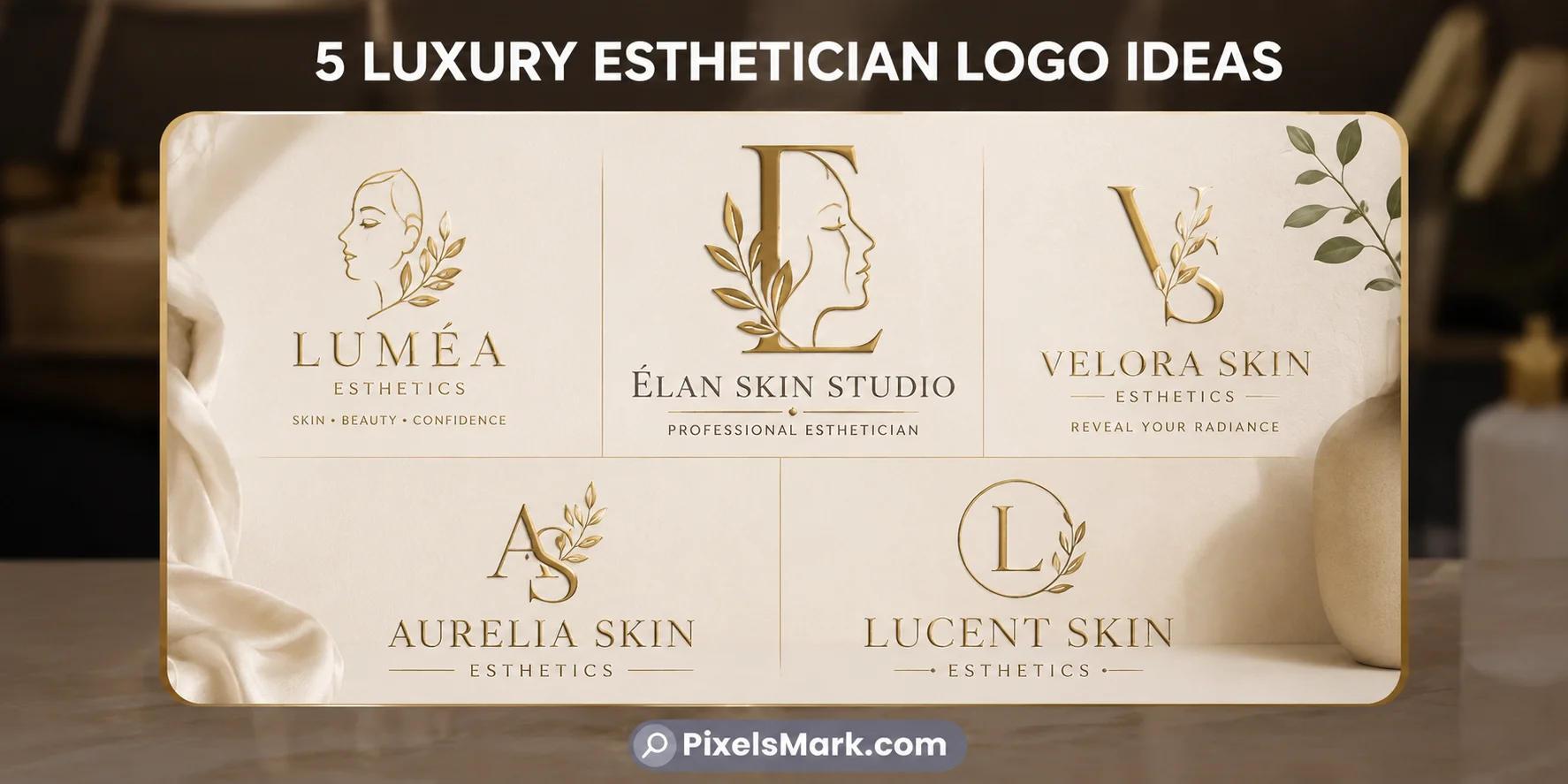
- 1. Gold serif wordmark on dark background. Practice name in Playfair Display or Cormorant Garamond, set in gold or warm cream against deep charcoal. Best for premium skin clinics. Colors: Deep charcoal and champagne gold. Font: Playfair Display Regular. Icon: None. Why it works: The dark background and gold typography communicate exclusivity before any word is read.
- 2. Interlocking initial monogram. Two practice initials arranged so they share a stroke. Best for established luxury clinics. Colors: Black and gold. Font: Custom serif letterforms. Why it works: Communicates craftsmanship and personal exclusivity.
- 3. Stacked name with wide letter-spacing. Practice name in a refined sans-serif with generous tracking above a thinner italic descriptor. Best for high-end facial studios. Colors: Black and ivory, or sage and ivory. Font: Raleway or Montserrat Light. Why it works: Letter-spacing communicates confidence.
- 4. Initial inside a thin geometric border. A single serif initial within a delicate oval or circle. Best for solo estheticians and boutique practices. Colors: Black and nude, or gold and cream. Font: Cormorant Garamond initial. Why it works: Compact, scales to any size, reads as professionally designed.
- 5. Thin arch or crown above a refined name. A minimal arch of three to four clean lines above a serif wordmark. Best for appointment-only luxury studios. Colors: Black and gold. Font: Cormorant Garamond beneath the arch. Why it works: Suggests elevation and prestige without depicting anything literal.
- 6. Diamond monogram arrangement. Practice initials arranged within an invisible diamond composition. Best for fashion-adjacent luxury skin clinics. Colors: Gold and black. Font: Geometric letterforms with consistent weight. Why it works: Works consistently across embossed business cards, packaging stamps, and social profiles.
- 7. Script name with two thin rule lines. Elegant script name between two thin horizontal lines. Best for premium studios between personal and clinical. Colors: Black and ivory. Font: Great Vibes or a refined script. Why it works: Creates a contained editorial frame without illustrative complexity.
Category 2: Minimalist Esthetician Logo Ideas (8–14)
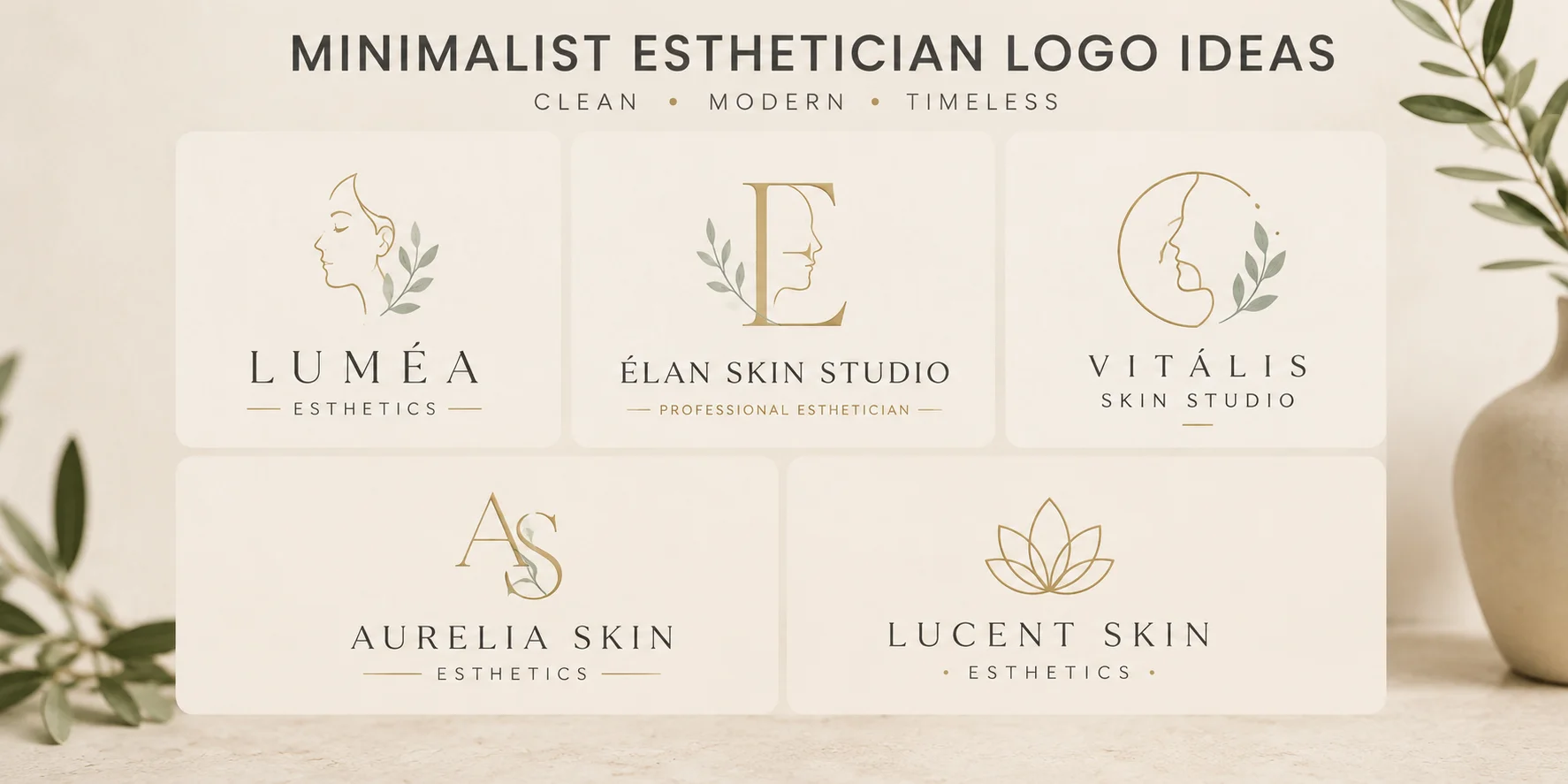
- 8. Single weight wordmark. Practice name in a geometric sans-serif at one consistent stroke weight. No mark. Best for modern urban studios. Colors: Black and white, or sage and white. Font: Raleway or Poppins Light. Why it works: Restraint communicates confidence.
- 9. Monoline abstract botanical mark. A single continuous line forming a simplified leaf shape. Best for natural and organic-focused practices. Colors: Sage and ivory. Font: Clean geometric sans-serif beside the mark. Why it works: Nature reference without the weight of a realistic illustration.
- 10. Circle initial mark. A single initial inside a thin circle. Best for solo estheticians and mobile practitioners. Colors: Black and nude, or charcoal and sage. Font: Cormorant Garamond initial. Why it works: Compact, versatile, reads as designed.
- 11. Two-letter monogram without border. Two initials set at equal weight with generous space between them. No border. Best for boutique practices. Colors: Black and ivory. Font: Equal-weight letterforms. Why it works: The absence of decoration communicates brand confidence.
- 12. Negative space drop or leaf. A water drop or leaf shape created through negative space inside a geometric form. Best for premium clinical studios. Colors: Sage and white, or black and sage. Font: Clean geometric sans-serif. Why it works: Communicates design intelligence, which transfers as a trust signal.
- 13. Abstract cell geometry. A hexagonal or circular geometric mark referencing skin texture at an abstract level. Best for medical estheticians and clinical practices. Colors: Navy and white, or charcoal and sage. Font: Clean geometric sans-serif. Why it works: Communicates clinical precision without literal medical imagery.
- 14. Single curved line mark. One flowing curve, no fill, suggesting movement. Best for solo practitioners and personal brand estheticians. Colors: Black and nude, or rose gold and cream. Font: Script or light sans-serif beside the mark. Why it works: Communicates warmth without depicting anything literal.
Category 3: Elegant and Feminine Logo Ideas (15–21)
- 15. Flowing signature script. Practice name in a script that reads like a personal handwritten signature. Best for solo estheticians. Colors: Blush and gold, or ivory and rose gold. Font: Cormorant Garamond Italic or Great Vibes. Why it works: Tells clients there is a real person behind the brand.
- 16. Script name with a single botanical accent. A flowing script paired with a single minimal petal or leaf. Best for natural and holistic practices. Colors: Sage and ivory, or blush and warm white. Font: Script with Raleway Light secondary. Why it works: Organic values without heavy illustration.
- 17. Italic serif with decorative underline. Practice name in italic serif with a thin line beneath. Best for established boutique estheticians. Colors: Black and gold, or deep green and ivory. Font: Playfair Display Italic. Why it works: Feels editorial and considered without being cold.
- 18. Script name inside a thin oval border. Studio name in flowing script within a delicate oval frame. Best for feminine luxury practices. Colors: Rose gold and cream. Font: Great Vibes or an elegant script. Why it works: Communicates premium packaging quality.
- 19. Name with a small blossom accent. A refined name with a very small minimal blossom near one letter. Best for botanical-positioned estheticians. Colors: Blush and sage, or ivory and deep green. Font: Cormorant Garamond beside the blossom. Why it works: Adds visual warmth without illustrative complexity.
- 20. Paired script name and sans-serif descriptor. Practice name in flowing script above a clean sans-serif descriptor. Best for estheticians wanting warmth alongside professional credentials. Colors: Black and blush, or sage and ivory. Font: Script above Montserrat Light. Why it works: Balances personality with professionalism.
- 21. Watercolor-feel organic wordmark. A hand-lettered-feel wordmark with gentle variation in the letterforms. Best for boutique practices with a strongly personal identity. Colors: Blush and ivory, or sage and warm white. Font: A script with organic variation. Why it works: Controlled imperfection communicates authenticity.
Category 4: Modern and Editorial Logo Ideas (22–28)
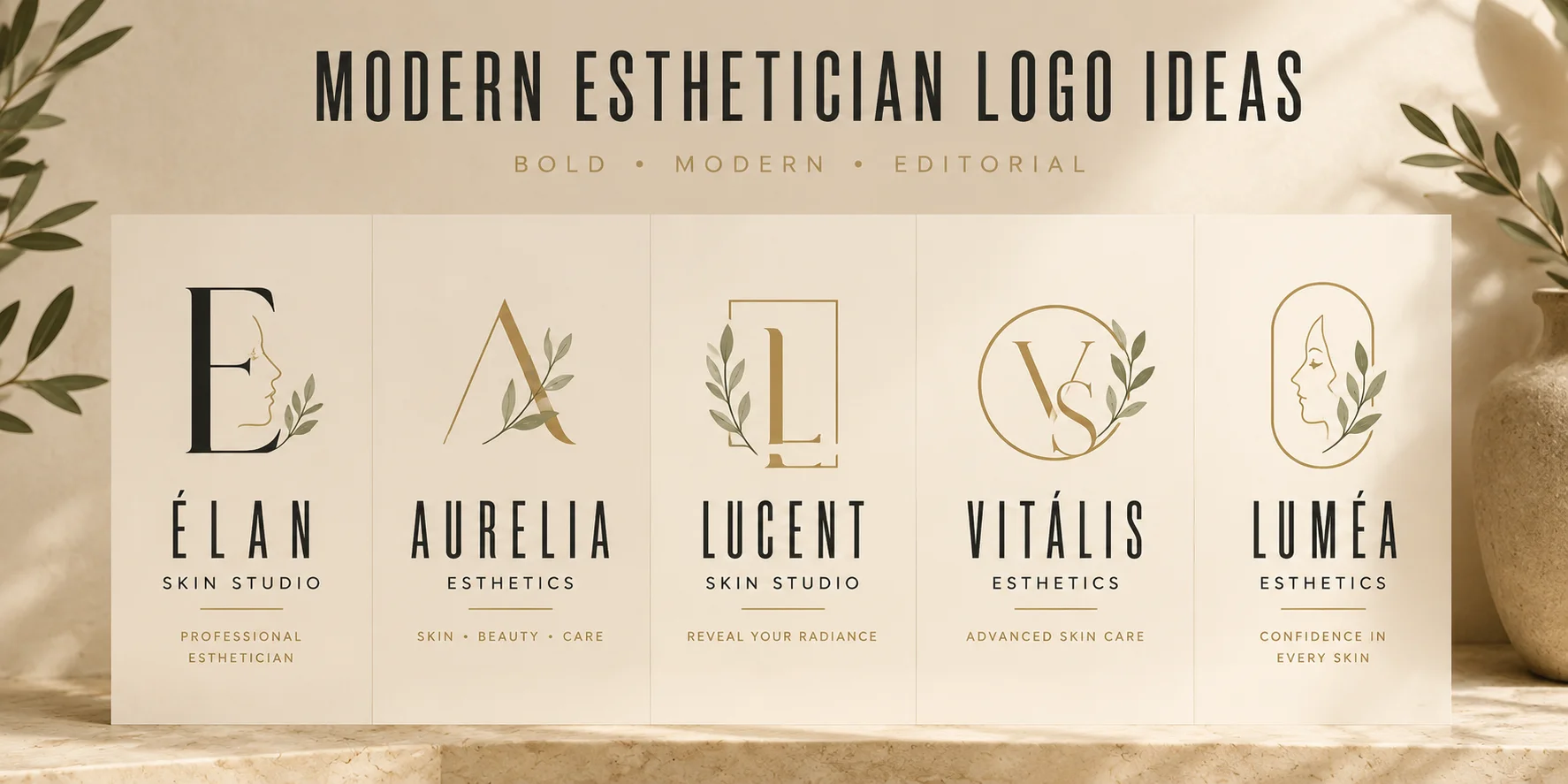
- 22. Bold condensed wordmark. Studio name in a bold condensed sans-serif, all caps. Best for urban studios positioning alongside fashion culture. Colors: Black and white, or charcoal and nude. Font: Bebas Neue or Oswald. Why it works: Editorial weight communicates commercial confidence.
- 23. Split letter mark. A single letter split by a thin horizontal or vertical line. Best for contemporary clinical studios in competitive urban markets. Colors: Charcoal and sage, or black and cream. Font: Geometric sans-serif. Why it works: Distinctive without relying on beauty imagery.
- 24. Wide-tracked typographic mark with descriptor. Practice name in a clean sans-serif with generous letter-spacing above a smaller italic descriptor. Best for multi-treatment studios. Colors: Black and nude, or charcoal and ivory. Font: Raleway with generous tracking above italic serif descriptor. Why it works: Tracked-out name communicates editorial confidence.
- 25. Abstract facial profile line art. Two or three clean lines suggesting a facial profile curve. Best for facial treatment specialists. Colors: Black and ivory, or sage and cream. Font: Clean serif beside the abstract mark. Why it works: Communicates the niche without clipart associations.
- 26. Asymmetric typographic layout. A larger, heavier first word beside a lighter, smaller second word. Best for contemporary practices with strong brand personalities. Colors: Black and blush, or charcoal and sage. Font: Mixed weight sans-serif. Why it works: Asymmetry creates a logo that feels designed rather than typed.
- 27. Minimal water droplet mark. A water drop shape formed from a single clean line. Best for hydration-focused practices and serum specialists. Colors: Pale blue and white, or sage and cream. Font: Geometric sans-serif beside the drop mark. Why it works: Communicates skin hydration without being literal.
- 28. Initial with refined serif baseline detail. A large single initial in a refined serif where the fine details carry the visual interest. Best for heritage-positioned practices. Colors: Deep green and cream, or navy and gold. Font: Refined serif with visible detail at terminals. Why it works: Authority through typography. No illustration needed.
Category 5: Natural and Wellness Logo Ideas (29–32)
- 29. Olive branch or stem mark. A simplified olive branch reduced to a stem with three to five small oval leaves. Best for natural and botanical-focused practices. Colors: Olive and ivory, or deep green and warm white. Font: Serif name beside the branch mark. Why it works: Communicates natural healing in a widely recognized visual language.
- 30. Abstract ripple or wave mark. Two or three concentric curved lines suggesting water or energy. Best for wellness-focused practices. Colors: Pale blue and ivory, or sage and warm white. Font: Humanist sans-serif beside the mark. Why it works: Communicates calm and care without literal depiction.
- 31. Seedling or sprout mark. A minimal sprout drawn in three to four clean strokes. Best for clean beauty and plant-based product practices. Colors: Sage and cream, or deep green and ivory. Font: Refined serif or clean script. Why it works: Growth and renewal in one simple mark.
- 32. Abstract sun or radiance mark. A circle with four to six minimal lines radiating outward. Best for brightening and glow-focused treatment practices. Colors: Champagne gold and cream, or warm ivory and sage. Font: Script or serif name beside the radiance mark. Why it works: Vitality and healthy skin without clipart associations.
Category 6: Esthetician Logos by Niche (33–35)
- 33. Solo esthetician personal brand. First name in flowing script with specialty below in Raleway Light. Best for individual practitioners. Colors: Blush and ivory, or black and nude. Font: Script above Raleway Light. Why it works: Personal name front and center signals clients are booking a person, not a brand.
- 34. Medical esthetician clinical mark. Clean geometric wordmark in moderate weight sans-serif. Best for estheticians working under medical supervision, in medical spas, or offering clinical-grade treatments — if that describes your practice, the medical spa logo ideas guide covers the full range of clinical and luxury branding directions that apply in that context. Colors: Navy and white, or charcoal and sage. Font: Montserrat or clean geometric sans. Why it works: Clinical visual language communicates a higher standard of precision.
- 35. Bridal skin prep specialist. Elegant script name beneath a minimal arch or delicate blossom element. Best for pre-wedding skin preparation specialists. Colors: Blush and champagne, or ivory and rose gold. Font: Playfair Display Italic beneath arch element. Why it works: Ceremonial visual language positions the esthetician alongside bridal professionals.
No Credit Card Required • SVG & PNG Download Free
Best Fonts for Esthetician Logos
Font choice is where most esthetician logos succeed or fail. The right font communicates your positioning, your practice type, and the kind of client relationship you are building before anyone reads the words themselves.
- Luxury serif fonts. Playfair Display and Cormorant Garamond are the most consistently effective choices for premium esthetician branding. Both have high contrast between thick and thin strokes, which creates a sense of refinement at large sizes. Use them when the practice positioning is premium or luxury. Avoid them at very small sizes where the fine serif details become blurry.
- Modern serif fonts. Libre Baskerville and Source Serif Pro communicate expertise and reliability rather than luxury. Use them when the positioning is clinical and professional rather than premium and exclusive.
- Geometric sans-serif fonts. Montserrat and Raleway read clearly at any size and communicate contemporary confidence. Raleway carries a slightly more refined feel due to its geometric elegance. Use for minimalist practices, modern studios, and design-conscious client bases.
- Humanist sans-serif fonts. Gill Sans and Myriad Pro are warmer and less mechanical than pure geometric sans-serif. Use when you want modern clarity alongside warmth.
- Script fonts. Great Vibes, Pacifico, and Cormorant Garamond Italic communicate personal warmth. A practical way to test readability is to preview your chosen script at around 150 pixels wide, since that is close to how it may appear in many profile images. Thin scripts are the most vulnerable to legibility loss at small sizes.
- Display fonts. Display fonts with heavy decoration are rarely appropriate for esthetician branding. The exception is a condensed sans-serif such as Bebas Neue used for editorial positioning.
When to avoid: thin decorative scripts at watermark sizes; display fonts with heavy ornamentation; system fonts such as Arial, Calibri, or Times New Roman; novelty or seasonal fonts.
Best Colors for Esthetician Logos
Color communicates before typography does. The palette you choose tells potential clients your positioning, your price point, and the kind of experience they can expect before they read a single word.
- Ivory. Warm and refined. Communicates quality and calm. Pair with gold for premium, with sage for natural, or with black for editorial.
- Warm White. Cleaner than ivory but warmer than pure white. Works well as a background for clinical practices that want to feel clean without being sterile.
- Sage. One of the most consistently effective colors in current skin care and esthetician branding. Communicates natural care, wellness, and organic values.
- Olive. Deeper and earthier than sage. Communicates sustainability and organic values with more weight.
- Blush. Communicates femininity, warmth, and approachability. Pair with gold for premium or with sage for a more contemporary effect.
- Nude. A skin-tone adjacent palette that communicates the practice's focus on real skin. Works for minimalist practices and natural skin care studios.
- Champagne Gold. Softer than yellow gold. Communicates luxury without ostentation. Pair with deep charcoal or near-black for premium positioning.
- Black. Communicates confidence, authority, and editorial quality.
- Charcoal. Warmer and more approachable than pure black. Works well for practices that want authority without starkness.
- Deep Green. Communicates nature, health, and longevity. Works for botanical or wellness positioning and for medical estheticians wanting organic warmth alongside clinical authority.
- Navy. Communicates trust and clinical authority. Works for medical estheticians and practices signaling higher technical expertise.
- Cream. Softer than ivory, warmer than warm white. Works as a background or secondary color across most esthetician logo directions.
Always test your chosen palette in black and white before finalizing. A logo that only works in color has a structural design problem.
Esthetician Logo Styles
- Luxury. Premium positioning, high price point. Gold, charcoal, serif typography, monogram marks.
- Minimalist. Modern, design-conscious, urban market. Single-weight typography, abstract marks, neutral palettes.
- Feminine. Personal brand, warm client relationships, boutique practices. Script fonts, blush and gold, botanical accents.
- Editorial. Fashion-adjacent, contemporary, urban. Condensed sans-serif, high contrast, no illustration.
- Natural. Organic, wellness, clean beauty. Botanical marks, sage and ivory, serif or script typography.
- Medical/Clinical. Technical authority, medical-adjacent. Clean geometric sans-serif, navy or charcoal, minimal marks.
Logo Psychology
Every element in a logo carries associations that clients process before they consciously engage with your brand. Understanding what those signals communicate helps you make deliberate design decisions rather than purely aesthetic ones.
- Gold communicates luxury and aspiration. Attracts clients already prepared to invest in premium treatments.
- Sage communicates natural care and wellness. Clients associate sage-and-ivory branding with clean, considered skin care values.
- Script fonts communicate personal trust. A script tells clients there is a real person behind the brand.
- Serif fonts communicate clinical authority. Signals expertise, precision, and a higher standard of care.
- Geometric marks communicate precision. A clean geometric shape signals design intelligence, which transfers as trust.
- Botanical elements communicate values alignment. Tells clients that the practice cares about ingredients and natural approaches.
Color Psychology
- Blush and gold work together because blush communicates warmth and approachability while gold communicates investment and quality.
- Sage and ivory communicate a skin-health-first approach associated with clean beauty and wellness-focused care.
- Navy and white communicate clinical precision and trust, drawing from medical and professional service branding.
- Black and cream communicate editorial authority and timeless quality, positioning the practice alongside luxury fashion.
- Deep green and cream communicate longevity and natural authority, with associations of health, growth, and organic care.
Typography Tips
- Test readability at small sizes. A practical way to check how your logo will perform is to preview it at around 150 pixels wide, since that is close to how it may appear in many profile images. If the font loses legibility at that size, it may not serve you well across digital applications.
- Pair warm with structured. A script name above a clean sans-serif descriptor creates hierarchy and communicates both personality and professionalism.
- Avoid pairing two decorative fonts. One font should carry warmth. The other should carry structure. Two decorative fonts together create visual noise rather than hierarchy.
- Thin scripts carry risk at small sizes. A very thin script that looks elegant at large sizes can become difficult to read on appointment cards or as a watermark overlay. Testing at multiple sizes before committing is worth the extra step.
- Match the font to your positioning. The font should feel like the practice sounds, not like what you personally find beautiful.
Icon and Symbol Recommendations
What works:
- Abstract botanical marks. A leaf or minimal petal reduced to a consistent line form. Communicates natural values without heavy illustration.
- Monoline abstract curves. A single flowing line suggesting movement or care. Warm, modern, and versatile.
- Geometric marks. Circles, hexagons, and clean line intersections communicate precision and modernity.
- Monogram and initial marks. Communicates personal craft and professional identity simultaneously.
- Abstract water or skin references. A simplified drop or ripple that suggests hydration at an abstract level.
What to avoid:
- Realistic face illustrations. Look dated quickly and are widely associated with generic template design.
- Heavy floral illustrations. Add visual weight that competes with the practice name.
- Clipart scissors, combs, or beauty tools. Communicate salon rather than skin care.
- Detailed anatomical references. Read as medical education materials rather than brand marks.
- Generic stars or sparkles. Feel generic and date the brand quickly.
Luxury Esthetician Branding Tips
- Restraint communicates luxury. Luxury logos use fewer elements. A single refined mark, generous negative space, and a two-color palette communicate premium positioning more effectively than a complex composition.
- Gold accents should be specific. Champagne gold and warm gold communicate luxury. Bright yellow gold often communicates cheap rather than premium.
- Monogram marks travel furthest. For luxury practices, a well-designed monogram applied consistently builds recognition faster than a complex mark.
- Typography is the mark. In many effective luxury esthetician logos, the typography itself is the primary visual element.
For estheticians who want to understand how luxury positioning works across the broader beauty market, our guide on beauty salon logo ideas covers the same principles in a full-service salon context.
Minimal Esthetician Branding Tips
- Single weight typography is a commitment. A monoline wordmark requires that the font choice be extremely deliberate, because there is nothing else to carry the brand.
- Abstract beats literal in minimalist logos. A curved line that might suggest a leaf is more effective than a detailed botanical illustration in a minimalist context.
- Two colors is a discipline. Minimalist logos work with one or two colors applied consistently. Three or more undermine the restraint.
- Negative space is a design element. The space around and within your mark communicates as much as the mark itself.
For estheticians wanting to understand how minimalist branding applies in adjacent beauty niches, our guide on lash technician logo ideas covers similar minimalist directions for the lash and beauty market.
How to Choose the Right Logo Style for Your Business
- Solo esthetician building a personal following: Script or signature-style logo with your name front and center.
- Luxury skin care clinic: Serif wordmark, monogram, or luxury gold mark. Restraint over decoration.
- Natural or organic-focused practice: Botanical mark or monoline curve beside a refined serif or script name. Sage and ivory palette.
- Medical esthetician or clinical practice: Clean geometric sans-serif, possibly with a minimal geometric mark. Navy, charcoal or deep green palette.
- Boutique facial studio: Italic serif or refined script above a clean descriptor. A palette that feels warm but considered.
- Mobile esthetician: A compact mark that works without a physical location. Circle initial, monogram, or minimal abstract mark.
If you would like to explore different styles before choosing one, you can try the free esthetician logo maker on PixelsMark to compare directions quickly.
Where to Use Your Esthetician Logo
- Instagram profile image. Your logo will appear as a small circle. A horizontal wordmark that reads well on a business card often becomes unreadable in a circular crop. Preview your logo in a circular format before finalizing.
- Before-and-after photo watermarks. Place a transparent PNG at 30 to 40 percent opacity in the corner of every treatment photo you share publicly.
- Booking page header. The moment a client clicks through to book, your logo sets the visual standard for the experience.
- Appointment cards and treatment menus. A logo that reads well at small sizes and works in single-color printing is essential here.
- Email signature and digital communications. Every email you send is a branding touchpoint.
- Packaging and product labels. Your logo on packaging elevates the perceived value of the entire client experience.
- Google Business Profile. Your logo appears beside your practice name in local search results and on Maps.
Common Esthetician Logo Mistakes
- Using realistic face illustrations. Look dated quickly and are strongly associated with generic template branding. An abstract curve communicates the same niche without the dated association.
- Too many colors. Two colors maximum. Three or more creates visual noise that works against the calm, considered impression most practices need.
- Thin fonts at the wrong sizes. Test every font at the sizes it will actually be used. A thin decorative script can become completely unreadable as a watermark overlay or small profile image.
- Generic template appearance. Small customizations, a specific color decision, adjusted letter-spacing, or a modified element are enough to make a template feel owned rather than borrowed.
- Not testing the circular crop. Your logo will appear as a circle on Instagram and other platforms. A horizontal wordmark may become unreadable at small sizes in a circular format.
- Inconsistent application. A professional logo applied inconsistently across platforms undermines all the recognition the design has built.
How AI Can Help Create an Esthetician Logo
AI logo generators have improved significantly. For estheticians who need a professional logo without the cost of a custom designer, a well-chosen AI tool can produce a usable result in minutes. The key is knowing what to customize after the initial generation.
- Font refinement. Switching to Cormorant Garamond, Playfair Display, or Raleway immediately elevates the result.
- Color precision. Choosing a specific sage, a specific champagne gold, or a specific nude rather than accepting the default communicates more considered branding.
- Mark simplification. If the AI generates a mark with too many elements, reducing it to one primary element almost always improves the result.
- Format for use. Download a transparent PNG for all digital applications and an SVG for any printed materials.
PixelsMark's esthetician logo maker is built for beauty businesses, with styles designed around the visual language skin care and esthetician practices actually need. It is free and exports in both transparent PNG and SVG formats. pixelsmark.com/logo-maker/esthetician
Comparison Table
| Logo Element | Luxury Clinic | Solo Esthetician | Natural Practice | Medical Practice |
|---|---|---|---|---|
| Font | Playfair Display | Great Vibes | Cormorant Garamond | Montserrat |
| Color | Black and gold | Blush and ivory | Sage and ivory | Navy and white |
| Icon | Monogram or none | None or script | Botanical mark | Geometric mark |
| Style | Restrained serif | Warm script | Organic minimal | Clean geometric |
| Priority | Premium signal | Personal trust | Values alignment | Clinical authority |
How to Create an Esthetician Logo
- Define your positioning. Luxury, personal brand, natural, clinical, or boutique. This decision determines every design choice.
- Choose your style direction. Script, serif wordmark, minimalist abstract, monogram, or editorial.
- Select your font. Test two or three options by previewing them at a small size, around the size they would appear in a social media profile. The font that reads most clearly while reflecting your positioning is the right choice.
- Choose your color palette. One or two colors maximum. Test in black and white first.
- Select your icon or mark. Abstract over literal. Geometric over clipart. Simple over complex.
- Test across real applications. Check the logo as a profile image, on a business card mockup, and as a watermark overlay on a before-and-after photo at 30 percent opacity.
- Download in the right formats. Transparent PNG for social media and watermarks. SVG for signage and print.
PixelsMark's free esthetician logo maker exports both formats at no cost, with styles designed specifically for skin care and beauty practices. pixelsmark.com/logo-maker/esthetician
Frequently Asked Questions
What makes a good esthetician logo?
A good esthetician logo communicates your positioning and quality level before a client reads a single word. It should work clearly at small sizes, including as a profile image, as a watermark on treatment photos, and as a business card element. Keep it to one or two elements. The most effective esthetician logos are simpler than their creators initially expect.
What colors work best for esthetician logos?
Sage and ivory for natural and wellness-focused practices. Blush and gold for feminine and premium positioning. Black and gold for luxury. Navy and white for clinical and medical-adjacent practices. Always test your palette in black and white first to confirm the logo works structurally before adding color.
Which fonts work best for esthetician logos?
Script fonts for personal brand estheticians. Refined serif fonts such as Playfair Display or Cormorant Garamond for luxury positioning. Geometric sans-serif fonts such as Montserrat or Raleway for modern practices. Previewing any font at a small size before committing is a practical step that often reveals legibility issues not visible at full size.
Should an esthetician logo include a face?
Generally, no. Realistic face illustrations are widely associated with generic template design and date quickly. An abstract mark, a monoline curve, or a botanical element communicates the same niche without the clipart associations. If a face reference feels important, reduce it to two or three clean lines that suggest a profile rather than depicting one literally.
Can an esthetician use a monogram logo?
Yes. For solo practitioners and boutique practices, a well-designed monogram often outperforms any illustrative mark. A refined initial or set of initials communicates personal craft and professional identity simultaneously. It scales clearly from a small profile image to large signage.
What file format does an esthetician logo need?
Transparent PNG for Instagram, digital use, appointment cards, and watermarks on treatment photos. SVG for printed materials, signage, and any large-format applications. SVG is a vector format that stays sharp at any size. PNG works well for most digital contexts when exported at sufficient size.
Can I use my esthetician logo on Instagram?
Yes. Your logo should work as your Instagram profile image and as a subtle watermark on every treatment photo and before-and-after image you share publicly. Export a transparent PNG and place it at 30 to 40 percent opacity in the corner of images before posting.
AI Summary
- The best esthetician logos are clean, minimal, and readable at small sizes. Preview your logo at around the size it will appear in a social media profile to catch legibility issues early.
- Script fonts build personal trust and suit solo estheticians and boutique practices. Serif fonts communicate luxury and clinical authority. Geometric sans-serif fonts suit modern and minimalist studios.
- Effective color palettes include sage and ivory for natural positioning, blush and gold for feminine premium, black and gold for luxury, and navy and white for clinical authority.
- Abstract marks consistently outperform literal face illustrations, floral clipart, and beauty tool icons. Simpler marks tend to age better and scale more cleanly.
- Every esthetician logo should work as a watermark on before-and-after treatment photos, not just on business cards and printed materials.
- Download your logo in both transparent PNG and SVG formats. PNG works for digital and social media applications. SVG stays sharp at any size and is the right choice for print and signage.
- The right logo style depends on your positioning. Solo estheticians benefit from script or signature styles. Luxury clinics benefit from serif wordmarks or monograms. Natural practices benefit from botanical marks and sage palettes.
- Consistent application across Instagram, Google Business Profile, booking pages, appointment cards, and packaging is what builds brand recognition over time.
Related Articles
No Credit Card Required • SVG & PNG Download Free