
Author
Pixels Mark
Release
Intensity
37 MIN READ
The best medical spa logo balances clinical credibility with aesthetic appeal. It should be simple enough to read on a consent form and refined enough to justify premium pricing. Most strong med spa identities combine one trust signal, such as clean typography or a precise geometric mark, with one luxury or wellness cue, such as champagne tones or generous white space. The correct balance depends on your treatments, pricing and the patients you want to attract.
- Medical spa logos must communicate both clinical trust and aesthetic transformation, but the ratio depends on your services and positioning.
- The most common med spa logo mistake is choosing symbols that misrepresent the actual services being offered.
- Color, typography and symbol choices should follow positioning decisions, not personal preference.
- Every logo must work at small sizes, in monochrome, and across signage, social media, consent forms and product packaging.
- A logo is not a brand. It is the starting point of one.
Already know the style you want? Start customizing with the PixelsMark Medical Spa Logo Maker.
What Makes a Good Medical Spa Logo?
Most logo advice stops at "make it clean and modern." That is not enough when you are running a business where patients are making decisions about their faces and bodies.
A medical spa logo carries a heavier brief than almost any other service industry. It needs to communicate clinical competence to a patient deciding whether to trust you with injectables or laser treatments. It needs to signal premium quality to a client comparing your practice against three competitors on the same street. And it needs to do both of those things with enough restraint that it reads on a business card, loads cleanly in an Instagram circle and looks appropriate on a consent form header.
The practices that get this right are not usually the ones with the most sophisticated mark. They are the ones whose logo accurately reflects what they actually offer and who they actually serve.
Relevance is the starting point. A logo that looks like a yoga retreat creates a positioning misalignment the moment a new patient walks in expecting a clinical consultation. The visual language should match the service level.
Distinctiveness is harder than it sounds. Most markets already have several med spas using blush palettes, gold accents and delicate serif fonts. Distinctiveness does not require being radical. It requires making at least one deliberate visual decision that local competitors have not made.
Legibility at small sizes is non-negotiable. The logo will appear at 32 pixels as a favicon, at 150 pixels as a social-media avatar and at varying sizes on appointment cards, treatment menus and email headers. If the design does not hold up at the smallest of those sizes, it is not finished.
Scalability means the mark can move from a 12mm emboss on a gift card to a 2-meter sign above the entrance without losing integrity. This is a design constraint that eliminates certain font choices and symbol types before any creative work begins.
Clinical trust is perhaps the most misunderstood quality on this list. Many owners try to communicate it through medical symbols, blue tones or the word "medical" in the name. The more durable source of trust is visual consistency and professionalism. A logo that is applied correctly across every patient touchpoint earns more trust than one that references medical imagery but appears poorly sized on the clinic's website.
Positioning accuracy ties everything together. The logo should represent the practice you have built, not an idealized version of it. Promising luxury through visual language and delivering a mid-market experience creates a dissonance that patients articulate in reviews.
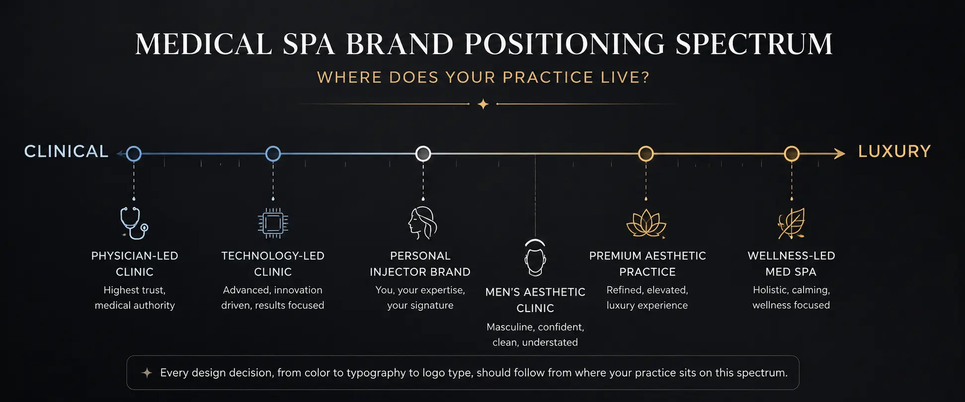
Choose Your Position on the Clinical-to-Luxury Spectrum
The standard advice to "blend medical credibility with luxury aesthetics" is correct but not specific enough to be useful in practice. Every branding decision that follows, including color, typography, logo type and icon choice, should flow from a single prior decision: where on the spectrum does your practice actually sit?
| Brand direction | Clinical emphasis | Luxury emphasis | Suited to |
|---|---|---|---|
| Physician-led clinic | High | Moderate | Advanced injectables, dermatology-adjacent services |
| Premium aesthetic practice | Moderate | High | High-ticket facial aesthetics, memberships |
| Wellness-led med spa | Low to moderate | High | Holistic experience with treatment add-ons |
| Technology-led clinic | High | Moderate | Laser, radiofrequency, body contouring |
| Personal injector brand | Moderate | Moderate to high | Founder-led boutique practice |
| Men's aesthetic clinic | Moderate to high | Moderate | Gender-neutral, results-focused positioning |
A physician-led dermatology-adjacent clinic and a boutique wellness practice offering facials with occasional filler add-ons are fundamentally different businesses. They serve different patients with different expectations, different price sensitivities and different definitions of what "professional" looks like. Treating them as variations of the same brand category is the source of most med spa logo mediocrity.
Before commissioning or creating a single design, place your practice on this spectrum. The answer to that single question will make the color, typography and symbol decisions significantly easier.
35 Medical Spa Logo Ideas
The following concepts are organized by brand direction rather than presented as a single undifferentiated list. Each idea includes the visual concept, the practice type it serves best, a palette direction, a typography recommendation and the most important risk to manage.
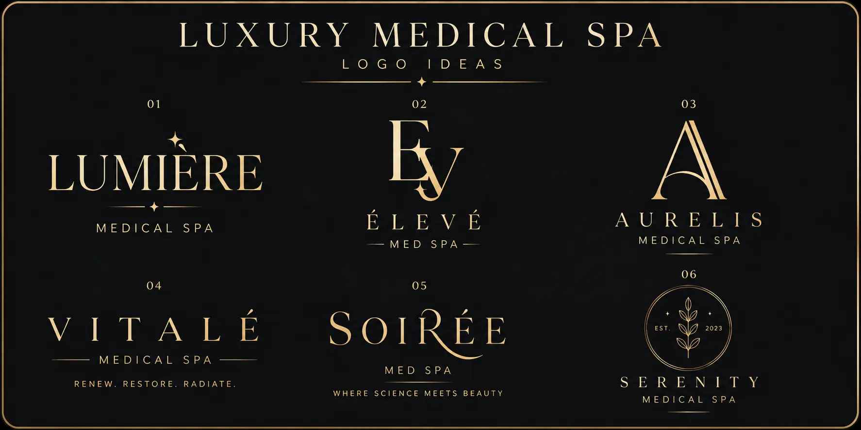
Luxury Medical Spa Logo Ideas
1. High-contrast serif wordmark. The clinic name set in a refined serif with significant stroke variation, placed in near-black on ivory or reversed on a deep background with no supporting icon. The typography carries everything. This approach communicates authority and refinement before the reader processes a single word of content. It requires a genuinely memorable clinic name to work at its best. Palette: charcoal and ivory, or near-black and champagne. Typography: Playfair Display or Cormorant Garamond. Primary risk: flourishes and overly decorative letterforms that look refined at large sizes and collapse into illegibility on appointment cards.
2. Champagne monogram. Two or three initials designed as a unified mark, with shared strokes, deliberate overlap or a carefully engineered negative space between the letters. A strong monogram functions simultaneously as a primary logo, a social-media avatar, an embossed sticker and an embroidery motif. Palette: champagne on black, or ivory on deep charcoal. Typography: custom serif letterforms. Primary risk: initials that produce unintended combinations or read ambiguously at small sizes without careful attention to the specific letter relationships.
3. Architectural lettermark. A single initial treated with the precision of a structural drawing rather than the warmth of a handcrafted letterform. The goal is a mark that looks considered and modern rather than decorative and traditional. Technology-forward luxury practices in particular benefit from this approach because it communicates design intelligence alongside clinical sophistication. Palette: black and white, or slate and ivory. Typography: geometric or modernist serif construction. Primary risk: becoming so abstract that the connection to the clinic name requires explanation.
4. Minimal black-and-ivory identity. The clinic name in a refined sans-serif, wide-tracked across a generous baseline, above a single line of smaller descriptor text. No icon, no color, no decoration. The entire identity rests on proportion, spacing and the quality of the typeface choice. Palette: black and white only, with champagne as a document and packaging accent. Typography: Raleway or Montserrat Light. Primary risk: blending into a market where many competitors have adopted similar minimal typographic directions.
5. Custom ligature wordmark. A wordmark where two adjacent letters share a design element, creating the visual impression of a bespoke typeface. This is a relatively rare approach in the med spa category, which makes it a genuine differentiation opportunity. The mark communicates considered craft and typically reads as more premium than a standard wordmark set in the same typeface. Palette: deep charcoal and ivory. Primary risk: ligature logos are difficult to produce without professional design involvement and often fail when recreated in different sizes without the original source files.
6. Fine-line emblem. A contained circular or oval composition incorporating the clinic name, a minimal submark and a thin border. Emblems communicate longevity and institutional trust. For a medical spa, an emblem signals that the practice has history and permanence, even if it was founded recently. Palette: gold and black, or black and cream. Typography: classic serif within the emblem. Primary risk: line weight so fine that the emblem deteriorates in all practical applications, requiring a separate simplified submark for digital use.
For practices whose positioning sits closer to the premium beauty salon end of the spectrum than the clinical end, our beauty salon logo ideas guide covers the luxury branding directions that apply across full-service beauty businesses.
Clinical and Trust-Focused Logo Ideas
7. Clean geometric wordmark. The clinic name in a geometric sans-serif with precise letter-spacing and consistent stroke weight. No icon, no gradient, no decoration. The precision of the type communicates clinical accuracy and a practice focused on results rather than atmosphere. Palette: navy and white, or charcoal and cool gray. Typography: Futura or Neue Haas Grotesk. Primary risk: choosing a geometric sans-serif without adequate attention to letterspacing, which produces results that read as generic template output.
8. Abstract medical precision mark. A geometric mark that suggests measurement, alignment or structural accuracy without referencing specific medical equipment. This approach gives a practice a visual asset that is ownable and distinctive rather than borrowed from the shared vocabulary of medical iconography. Palette: deep teal and white, or slate and ivory. Primary risk: abstract marks require consistent repetition across every touchpoint before they accumulate recognition.
9. Skin-layer abstraction. A mark that references cellular or dermal structure through concentric shapes or layered geometry without depicting anything recognizable as anatomy. The reference should be felt rather than identified. Works particularly well for skin clinics and dermatology-adjacent practices. Palette: warm nude and charcoal, or white and cool gray. Primary risk: the biological reference becoming so literal that it resembles a science textbook diagram.
10. Structured initials. The clinic initials set in a clean sans-serif with deliberate proportion and generous spacing. No border, no ligature, no decoration. The quality depends entirely on the letterform choices and the precision of the spacing. Palette: charcoal and white. Primary risk: requiring strong brand application across all touchpoints to distinguish itself from other initials-based marks in the same market.
11. Negative-space cross. A cross formed through the absence of material within a simple geometric shape, rather than as a positive symbol. This communicates a health or medical association without the directness of a pharmacy or hospital cross. Palette: white on navy, or white on deep teal. Primary risk: negative-space marks require careful execution and generous viewing space to read correctly, which limits their use at very small sizes.
12. Physician-name identity. The founder's professional name in a clean, confident typeface, paired with a small credentials identifier in a secondary size. Best for practices where the physician's qualifications are the primary differentiator in the market. Palette: slate and ivory. Primary risk: building a brand that cannot easily be transferred or expanded beyond the founding provider.
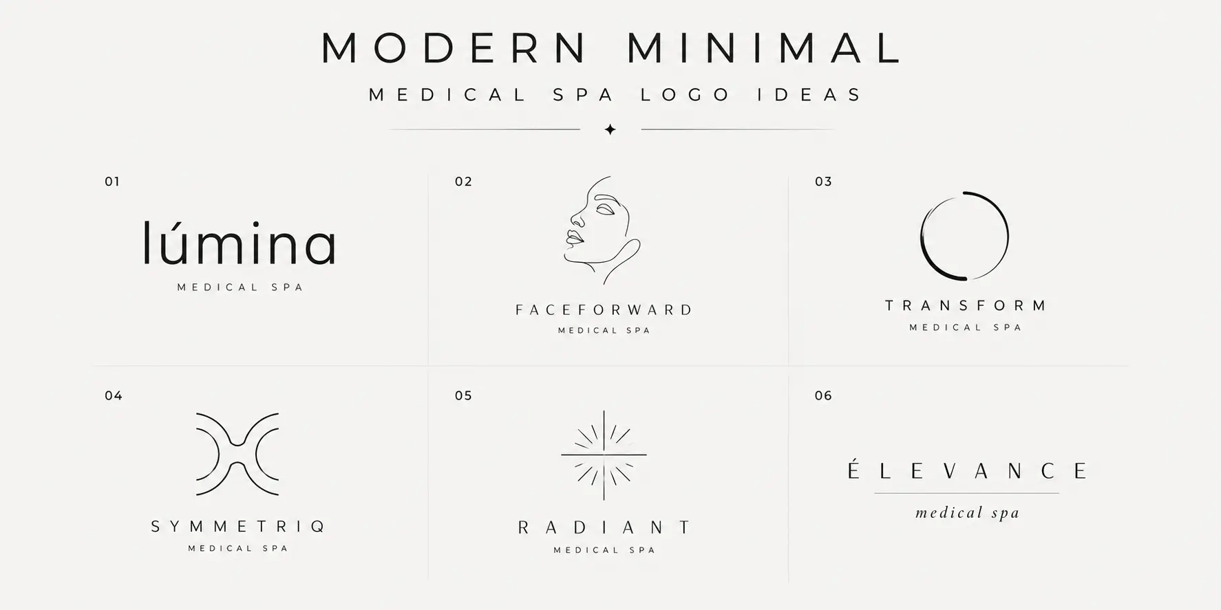
Modern and Minimal Logo Ideas
13. Lowercase sans-serif wordmark. The clinic name in a refined lowercase geometric sans-serif with consistent weight and deliberate spacing. The lowercase choice communicates approachability and contemporary confidence. Works well for practices targeting a younger, design-aware clientele. Palette: black and white, or sage and charcoal. Primary risk: lowercase may reduce perceived clinical authority for certain patient demographics.
14. Single-line facial contour. A minimal face profile suggested by one or two controlled lines, abstract enough to serve as a mark rather than an illustration. The concept is viable but widely used. A single-line face mark that reads as template output immediately signals that the brand was assembled rather than conceived. Palette: black and ivory, or blush and charcoal. Primary risk: resembling existing marks in this category without a highly distinctive execution.
15. Circular transformation mark. An abstract circle with one element of visual tension or directional movement, suggesting renewal or change without literal representation. The transformation concept is central to what medical spas sell. Palette: deep teal and white, or sage and cream. Primary risk: circles are so pervasive in logo design that strong color, proportion and typographic decisions are needed to avoid appearing generic.
16. Abstract symmetry symbol. A balanced, symmetrical mark that suggests harmony or bilateral precision, with obvious resonance in facial aesthetics where symmetry is a stated treatment goal for many patients. Palette: muted teal and ivory. Primary risk: symmetrical marks can appear passive or static without an element of visual energy in the proportions.
17. Minimal radiance motif. A mark suggesting light expansion or skin luminosity through a controlled, reduced form, without depicting a sun or starburst. Suited to practices emphasizing glow, brightening treatments or phototherapy. Palette: champagne and ivory, or warm white and taupe. Primary risk: becoming decorative rather than functional without a rigorous reduction process.
18. Wide-spaced typography with fine descriptor. The clinic name in wide-tracked capital letters above a minimal smaller descriptor. The space between the letters communicates confidence and refinement. Demands a short, distinctive clinic name to carry the direction. Palette: black and ivory. Primary risk: the effectiveness is entirely proportional to the distinctiveness of the business name.
Natural and Wellness-Led Logo Ideas
19. Controlled botanical geometry. A leaf or botanical element reduced through careful geometric abstraction until the organic origin is felt rather than seen. Occupies a useful middle ground between clinical precision and soft botanical art. Palette: sage and ivory, or stone and warm white. Primary risk: the market contains many geometric botanical marks, requiring a distinctive color choice and careful reduction to stand apart.
20. Leaf-and-light combination. A botanical element paired with a subtle light or radiance reference. The two elements should be reduced until they form a coherent single mark rather than two separate symbols placed together. Palette: sage and champagne. Primary risk: combination marks require more visual space and can become cluttered when both elements are given equal prominence.
21. Organic monogram. Initials constructed with slightly softened terminals and organic proportional relationships rather than strict geometric precision. A practical choice for holistic practices where the personal relationship between provider and patient is central to the brand promise. Palette: sage and deep charcoal. Primary risk: organic proportions can appear inconsistent in digital formats without careful vectorization.
22. Soft earth-tone wordmark. The clinic name in a readable serif or refined sans-serif set in warm brown, stone or deep sage. Color carries the positioning, which means this direction works best when the chosen tone is genuinely distinctive in the local market. Palette: warm brown, stone, warm sage. Primary risk: a color-led identity functions well in full color and poorly in monochrome applications.
23. Renewal-ring symbol. An incomplete ring or arc suggesting cyclical renewal without closing into a simple circle. Communicates that the process of improvement is ongoing rather than finished. Palette: muted teal and white, or sage and ivory. Primary risk: an incomplete shape must read as a deliberate and confident design decision rather than appearing unfinished.
24. Water-inspired abstract mark. A fluid, linear form suggesting water movement, hydration or cellular flow without depicting a wave or literal water reference. For practices offering IV hydration therapy, aquafacials or hydration-focused skincare. Palette: pale blue-gray and white, or soft teal and cream. Primary risk: fluid lines are inherently harder to distinguish without strong proportional and color decisions.
Technology-Led Aesthetic Logo Ideas
25. Laser-light symbol. A controlled mark built from converging lines suggesting light focus or beam precision, without depicting a device or clinical instrument. The execution should feel refined and intentional, closer to optical precision than clinical directness. Palette: deep graphite and white, or cobalt and cool gray. Primary risk: converging lines can resemble corporate logos from unrelated industries if proportions are not carefully tuned to the aesthetic medicine context.
26. Precision grid mark. A geometric mark organized on a regular grid or modular structure, communicating the order and measurement that patients associate with technology-led treatments. Palette: charcoal and white. Primary risk: pure grid marks can read as overly technical or engineering-adjacent for most aesthetic practice contexts.
27. Gradient-free futuristic wordmark. A forward-leaning, clean sans-serif wordmark designed without gradient fills, metallic treatments or digital-only effects. The gradient-free constraint is a practical requirement: logos must work in embroidery, single-color printing and engraving as well as on screens. Palette: cool white and slate. Primary risk: futuristic typographic directions date more quickly than classical or modernist ones.
28. Cellular abstraction. A mark referencing biological structure such as a cell membrane or tissue boundary through abstract shapes without any illustrative realism. For practices differentiating through scientific knowledge of skin biology. Palette: warm gray and ivory. Primary risk: the biological reference must read as deliberate and informed, not incidental.
29. Skin-renewal geometry. A mark built from overlapping or layered shapes communicating cellular renewal through structural metaphor. For anti-aging and skin health clinics, the concept of layered renewal connects directly to the mechanism of many treatments. Palette: cool nude and charcoal. Primary risk: increasing the number of overlapping layers increases visual complexity and requires careful testing at small sizes.
30. Modular icon system. A primary mark constructed from geometric units that can be recombined, isolated or used as a repeating pattern across branded materials. Best suited to practices planning to expand to multiple locations or develop a product line. Palette: two to three controlled colors. Primary risk: modular systems require a brand-guidelines document to be applied consistently.
Personal Injector and Boutique Practice Ideas
31. Founder signature with readable support font. A genuine or carefully stylized version of the founder's own signature serves as the primary wordmark, communicating personal ownership and direct accountability in a way that no designed mark can replicate. Below it, a clean secondary typeface carries the business descriptor. For an aesthetic injector, patients are not booking a procedure from a clinic, they are booking an appointment with a specific provider. Palette: black on white or ivory. Primary risk: handwritten signatures are often illegible at small sizes and require careful refinement before use across all applications.
32. Initial-based monogram. A clean, simple monogram using the injector's initials, designed without flourishes, borders or embellishment. The restraint is the quality signal. For practitioners building a personal brand that will eventually extend beyond a single location, a strong initial mark is a more portable asset than a signature. Palette: black and champagne, or navy and ivory. Primary risk: initial marks in the aesthetics category have become widespread enough that specific letterform construction and spacing decisions must do significant differentiation work.
33. Name plus credentials. The founder's name in a clean professional face, followed by relevant clinical credentials in a smaller secondary size. For a nurse practitioner, physician assistant or physician specializing in aesthetic medicine, placing the credential beside the name communicates a level of authority that neither a geometric mark nor a monogram can convey. Palette: charcoal and white. Primary risk: credentials can reduce visual impact on platforms where they are truncated or invisible at small sizes.
34. Boutique seal. A circular or oval seal incorporating the practice name, a minimal internal submark and optionally the founding year or location. Seals communicate permanence and institutional confidence. Every seal identity needs a simplified secondary mark for small-size digital applications. Palette: black and gold, or charcoal and ivory. Primary risk: excessive fine-line detail that deteriorates in all practical applications.
35. Personal-name wordmark with submark. The founder's full name set as a strong primary wordmark, paired with a small abstract or initial-based submark that functions independently as a social avatar. This hybrid approach gives the practice the warmth of a personal-name brand while providing the visual flexibility of a secondary mark at every size and format. Palette: one dominant color plus black or white. Primary risk: maintaining visual coherence between the wordmark and the submark requires more design precision than using either element alone.
Medical Spa Logo Styles Compared
Choosing a logo type is a strategic decision, not an aesthetic one. The format you choose determines how your brand behaves across every application from a Google Business Profile thumbnail to a 3-meter entrance sign.
| Style | Best for | Main advantage | Main risk |
|---|---|---|---|
| Wordmark | Premium clinics with strong names | Timeless and infinitely versatile | Typography must carry the entire identity |
| Monogram | Founder-led practices with memorable initials | Strong avatar and submark from day one | Initials require significant brand exposure before recognition builds |
| Combination mark | Multi-service clinics needing flexibility | Descriptive and visually complete | Can become crowded, especially at small sizes |
| Abstract mark | Technology-led and innovation-forward practices | Ownable and genuinely distinctive | Needs consistent exposure to build recognition |
| Emblem | Established boutique practices signaling longevity | Premium and immediately complete | Almost always fails at small sizes without a separate submark |
| Script | Personal brands and founder-led boutiques | Warm, individual and immediately personal | Readability problems at small sizes and in monochrome applications |
The most common mistake in this decision is choosing a format based on what looks most impressive in a mockup rather than what performs best across the specific applications the practice actually uses. Choose the format that works in your most demanding application, then verify it performs in your most aspirational one.
Explore different logo styles and customize your direction before downloading.
Best Colors for Medical Spa Logos
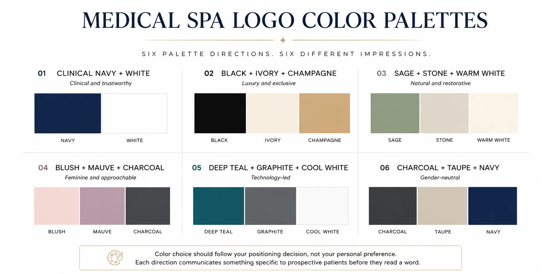
Color is where most medical spa branding goes wrong. Not because owners choose ugly colors, but because they choose colors that look pleasant rather than colors that accurately represent their positioning.
The blush-and-gold combination that dominates the med spa category is not intrinsically wrong. It is wrong because it has become the default, which means it no longer differentiates. A prospective patient comparing several local practices online who encounters four nearly identical blush-and-champagne logos has no visual information to help them choose.
| Positioning | Suitable palette direction |
|---|---|
| Clinical and trustworthy | Navy, blue-gray, white, charcoal |
| Luxury and exclusive | Black, ivory, champagne, muted gold |
| Natural and restorative | Sage, stone, warm white, muted green |
| Feminine and approachable | Blush, mauve, cream, soft brown |
| Technology-led | Deep teal, graphite, cool white, cobalt accents |
| Gender-neutral | Charcoal, taupe, navy, soft gray |
Clinical navy and white communicates authority, cleanliness and precision. It is underused in the aesthetic medicine category relative to how well it performs at communicating provider-level credibility. The risk is coldness, managed through warmer secondary tones in interior design and communications rather than in the logo itself.
Champagne and ivory is the highest-potential and highest-risk palette in the category. When the specific tones are chosen with care and the typography matches their refinement, this combination is genuinely luxurious. When the champagne is too yellow or the serif is too generic, the same palette produces a template. The difference is in the specificity of the execution, not the palette concept.
Sage and stone communicates restoration, organic care and environmental consciousness. For practices that genuinely incorporate botanical products, clean skincare or integrative medicine, this palette provides accurate positioning. For practices using standard clinical injectables, it may create a brand promise the experience cannot fulfill.
Blush and charcoal is a more sophisticated alternative to the standard blush-and-gold combination. The charcoal grounds the femininity of the blush and communicates more clinical seriousness. It reads as more contemporary and less generic than the blush-and-champagne standard.
Deep teal and cool gray is one of the most underused palettes in the med spa category and one of the most capable. It communicates technology, sophistication and precision without the coldness of pure clinical navy. For practices leading with device-based treatments or laser services, this palette communicates the right things without borrowing pharmaceutical branding conventions.
Black, cream and muted gold is the most aspirational direction and the most demanding to execute. The difference between this palette communicating timeless luxury and communicating generic premium-template branding comes down to three things: the specific warmth of the gold tone, the quality of the typeface, and the discipline to resist adding additional visual elements once the three elements are in place.
One practical note that affects every palette: if any element of your logo identity relies on a gradient or metallic finish for its impact, that element will not translate to embroidery, single-color printing, engraving or faxed consent forms. Design the flat-color version first. Let the metallic treatment be an enhancement rather than a requirement.
Best Fonts for Medical Spa Branding
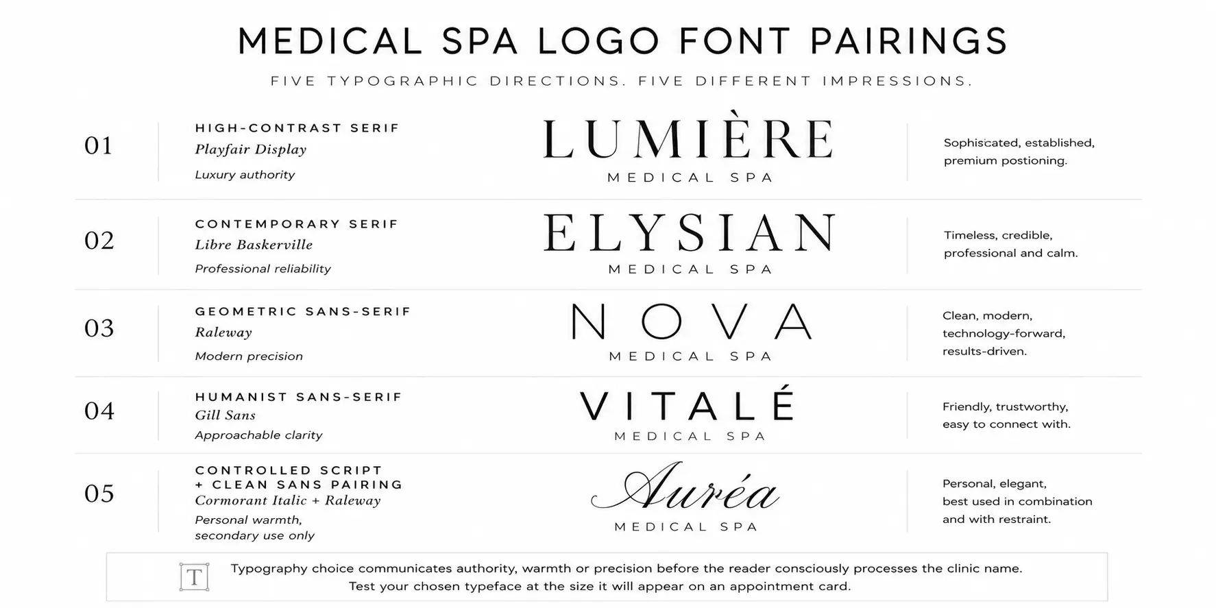
The typography choice in a medical spa logo does more work than any other single element. It communicates authority or approachability, contemporaneity or timelessness, clinical precision or personal warmth, often before the viewer has consciously processed the clinic name.
High-contrast serifs such as Playfair Display and Cormorant Garamond are the most frequently chosen direction in luxury med spa branding. The variation between thick strokes and fine hairlines creates visual refinement that reads as intentional craft. The specific risk is the fine hairlines themselves. At small sizes, in poor print conditions or on embroidered uniforms, those fine strokes disappear. Test any high-contrast serif at the size it will appear on your business card before finalizing.
Contemporary serifs such as Libre Baskerville and Source Serif Pro offer the authority associations of traditional serif typography with significantly better performance across size ranges and output formats. They communicate professionalism and permanence without the overt luxury associations of high-contrast serifs.
Geometric sans-serifs such as Futura, Raleway and Montserrat communicate modernity, precision and clarity. They perform consistently across every size and format, pair cleanly with serif display fonts and provide a strong visual foundation for technology-led practices. Distinctiveness depends entirely on spacing, proportion and color decisions rather than the typeface itself.
Humanist sans-serifs such as Gill Sans or Myriad Pro introduce warmth into the clarity of a sans-serif construction. The humanist letterforms have organic proportions that reference handwriting more closely than geometric typefaces do, giving them an approachability that suits practices whose brand centers on the personal provider relationship.
Controlled scripts such as Cormorant Garamond italic or Great Vibes add personal warmth when used for a founder's name or in a secondary descriptor role. The rule is absolute: never use a script as the only typeface. Scripts are almost always illegible at small sizes, in monochrome and in certain print formats. They work as accompaniment to a clean secondary face, not as the sole typographic element.
The most reliable typographic strategy for most med spa identities is the serif-and-sans-serif pairing. The serif communicates authority in the primary name. The sans-serif communicates clarity in the descriptor and supporting information. Together they cover the clinical-luxury spectrum without either element overwhelming the other.
Medical Spa Logo Symbols: What to Use and What to Avoid
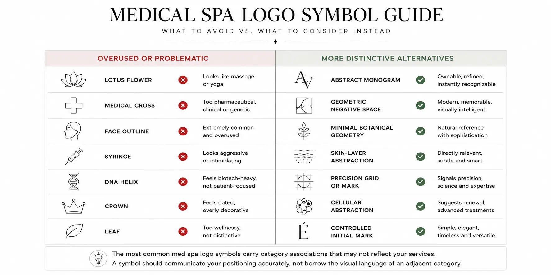
Symbols work when they communicate something accurate about the practice's positioning that the typography alone cannot convey. They fail when they borrow the visual language of an adjacent category, when they imply credentials the practice cannot substantiate, or when they have been repeated so frequently that they carry no differentiating signal.
| Symbol | What it communicates | Risk |
|---|---|---|
| Face outline | Beauty, facial aesthetics | Extremely common. Requires distinctive execution to avoid template appearance |
| Lotus | Relaxation, wellness | Strongly associated with massage and yoga rather than aesthetic medicine |
| Medical cross | Healthcare authority | Can appear pharmaceutical, hospital-adjacent or overly clinical |
| Leaf | Natural care, organic values | Generic without rigorous simplification |
| DNA helix | Biological science | May overstate the scientific sophistication of the services offered |
| Syringe | Injectable treatments | Intimidating and too literal for most positioning |
| Crown or diamond | Luxury and prestige | Frequently appears inexpensive or generically aspirational |
| Initials | Personal ownership and distinctiveness | Requires strong typographic execution to carry the mark |
| Abstract geometric mark | Precision, modernity, innovation | Needs consistent exposure before recognition builds |
| Negative-space form | Design intelligence and sophistication | Requires skilled execution to read correctly across all sizes |
The most reliable approach for most practices is to consider whether any symbol adds genuine meaning that the typography and color cannot communicate alone. In many cases the answer is that it does not, which means the most distinctive decision is to use no symbol at all and invest the design budget in typography and spacing quality instead.
Make Sure Your Logo Looks Like a Medical Spa, Not a Massage Studio
Template libraries, stock imagery sites and many logo generators group medical spas alongside massage therapy, yoga studios, meditation centers, aromatherapy and general day-spa businesses. The result is a large volume of med spa branding that uses the same lotus flowers, flowing water, meditation-adjacent imagery and soft botanical references as every other category in the wellness sector. Licensed estheticians transitioning into or building within a clinical aesthetic practice face the same distinction — our esthetician logo ideas guide covers how skin care practices navigate the positioning gap between personal beauty and medical-adjacent services.
This matters because a med spa performing injectables, laser resurfacing, radiofrequency body contouring or microneedling is operating in a fundamentally different clinical category from a relaxation-focused day spa. Real design briefs from aesthetic clinic owners consistently show this awareness. One brief explicitly rejected massage, yoga and floral symbolism because the business focused on laser treatments and body contouring, not relaxation services.
The symbols most likely to communicate the wrong category for a med spa include lotus flowers, meditation hand gestures, stones and pebbles, flowing water references, incense and candle imagery, and wind or breath motifs. These are fine symbols for wellness businesses that offer those associations honestly. For a practice offering physician-level aesthetic treatments, they misrepresent what the patient will experience.
The symbols that create different but equally problematic associations include literal syringes and needles, red medical crosses, caduceus symbols, capsule or pharmaceutical imagery and clinical anatomical diagrams. These pull too far in the opposite direction, from wellness into hospital or pharmaceutical territory, which is equally inaccurate for most aesthetic medicine practices.
The most defensible creative territory for most med spas is abstract marks, refined initials and wordmarks that communicate clinical precision and personal refinement without borrowing imagery from either adjacent category.
Common Medical Spa Logo Mistakes
The ten most frequent errors in med spa logo design, and what each one actually costs the practice:
Looking like a massage studio. The cost is category confusion that reduces conversion rates from prospective patients specifically looking for medical-level aesthetic services. Review every symbol and color choice against the actual service menu.
Copying the same face-line icon. The cost is zero memorability in a market where prospective patients see the same mark across multiple practices. Choose this direction only with a highly distinctive execution, or choose a direction not already saturated locally.
Using unreadable scripts. The cost is a logo that performs differently across applications, creating an inconsistent brand impression. Test any script at 32 pixels before finalization.
Stacking multiple luxury signals. Gold, serif fonts, crown elements, diamonds and a script name in one composition do not amplify each other. They compete and produce visual noise. Choose one or two strong luxury signals and remove the rest.
Using a medical cross too literally. The cost is being visually associated with pharmacies, hospitals and emergency services rather than premium aesthetic medicine. Explore negative-space treatments or geometric references rather than the literal symbol.
Choosing a gradient without a flat version. The cost is a logo that only functions in digital formats. Design the flat version first and treat the gradient as an enhancement.
Designing only for Instagram. The cost is a logo that looks beautiful in social media mockups and fails in real-world clinical settings. Test across at minimum five applications before approving any design.
Failing to review local competitors. The cost is unknowingly choosing a direction that resembles a competitor's branding. Save and review every local med spa logo before making any visual decisions.
Omitting a submark or avatar version. The cost is a brand that cannot function at the sizes required by social media platforms. Design a compact secondary mark as part of every logo project.
Treating the logo as the complete brand. The cost is a beautifully designed mark applied inconsistently, which undermines trust more efficiently than a mediocre logo applied consistently. Before the logo is approved, create a simple application guide documenting the correct size, color and spacing for every primary use case.
How to Design a Medical Spa Logo
The process that produces the most effective med spa logos is not primarily about aesthetic decisions. It is primarily about strategic clarity before any visual work begins.
- Define your services and positioning. List the two or three treatments that generate the most revenue and most clearly define the practice. Decide where the practice sits on the clinical-to-luxury spectrum before any designer or tool is engaged.
- Identify your ideal patient. Describe the person who books the most appointments, returns most consistently and refers others. The logo should make that person feel they have found the right practice.
- Review local competitors systematically. Save the logos of every competing med spa in the market area. Record which colors, symbols and type styles appear most frequently. The open space in a local market is more valuable than any global trend.
- Choose your clinical-to-luxury balance. Use the spectrum table from the earlier section. Document the answer before moving to any visual decisions.
- Select the logo format. Choose between wordmark, monogram, combination mark, abstract mark, emblem or script based on how the practice needs to function across its most demanding applications.
- Choose one palette direction. Select one of the six directions from the color section. Test it in monochrome before committing. If the mark does not work in black and white, the color is carrying work that the form should be doing.
- Select and test typography. Choose the primary typeface and, where needed, a secondary pairing. Test the specific clinic name at large display size, appointment card size and social avatar size before finalizing.
- Generate concepts and compare. The PixelsMark Medical Spa Logo Maker allows rapid exploration of different directions with the practice's actual name and chosen palette. Compare at least three genuinely different approaches before committing to a direction.
- Test across real applications. Minimum five tests: 32-pixel favicon, Instagram profile circle, website header at desktop and mobile sizes, appointment card and storefront signage.
- Build the complete logo system. Primary horizontal logo, stacked version, submark or social avatar, one-color version, reversed version, and source files in SVG and transparent PNG formats. Document color values and typeface names.
Where Your Medical Spa Logo Must Work
A logo that performs well in the presentation mockup but fails in real-world applications is not a finished logo. It is a design that has not been tested.
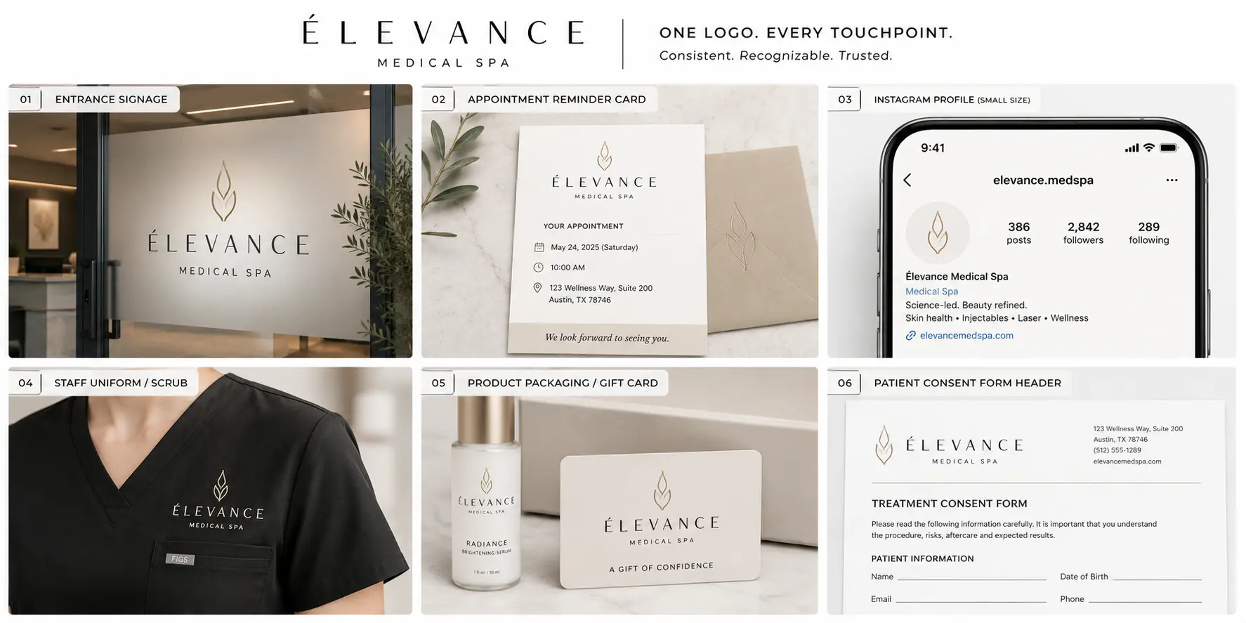
The actual touchpoints where a medical spa brand appears in practice: Google Business Profile icon. Instagram, Facebook and social media profile. Website header at both desktop and mobile sizes. Storefront or building signage. Reception desk feature wall. Consultation and treatment room. Appointment reminder cards. Patient intake and consent forms. After-care and treatment plan documents. Staff uniforms and scrubs. Product packaging and retail labeling. Gift card and membership card design. Email signature and newsletter header. Before-and-after social media graphics. Online advertising and retargeting assets.
Consistency across every one of these touchpoints compounds over time into the recognition and trust that drives referral behavior. A prospective patient who encounters a professional brand online and then receives a poorly formatted consent form with an inconsistent version of the same mark registers the discrepancy even if they cannot name it.
AI Logo Maker or Custom Medical Spa Branding?
| Option | Best for | Advantage | Limitation |
|---|---|---|---|
| AI logo maker | New or budget-conscious practices | Rapid concept exploration and immediate customization | Requires careful direction and customization to avoid generic output |
| Editable template | Practices with a clear visual direction | Immediately editable and often affordable | May resemble competitors using the same source template |
| Freelance designer | Defined project with a specific brief | Personal collaboration and original work | Quality and strategic understanding vary considerably |
| Branding studio | Multi-location or premium market positioning | Complete strategic identity system | Higher investment and longer timeline |
Most new practices benefit from beginning with an AI logo maker to explore several different directions quickly and inexpensively before investing in more involved development. The PixelsMark Medical Spa Logo Maker generates editable concept variations that can be adjusted by color, font, icon and layout before download.
Final Medical Spa Logo Checklist
Before approving any medical spa logo for use across patient-facing materials, verify the following:
- Does it reflect the actual treatment mix rather than a generic spa aesthetic?
- Does it communicate the appropriate level of clinical authority for the practice's services?
- Is it visually different from the logos of direct local competitors?
- Is the clinic name readable at 32 pixels without any reduction in confidence?
- Does the mark work in a single flat color without losing its integrity?
- Is there a compact submark or avatar version that functions at social-media profile sizes?
- Does it work on building or window signage at the sizes the practice requires?
- Is it free from detail that deteriorates at small sizes or in poor reproduction conditions?
- Are SVG and transparent PNG files available for every logo variation?
- Are brand colors documented in HEX, RGB and CMYK for both digital and print use?
- Are the typefaces named, licensed and documented?
- Has trademark availability been independently reviewed with a qualified legal professional?
The last point is important: a logo can be commercially usable without being legally registrable or exclusively ownable. Trademark clearance is a separate process from logo design and requires professional legal review before commercial launch.
Frequently Asked Questions
What is the best color for a medical spa logo?
There is no single correct answer because the right color depends on the practice's positioning. Navy and white suit physician-led clinics where clinical authority is the primary differentiator. Champagne and ivory suit luxury aesthetic practices. Sage and stone suit natural wellness-led businesses. Blush and charcoal suit boutique feminine practices. Deep teal and graphite suit technology-forward clinics. The starting point is always the positioning decision, not the color preference.
What font is best for medical aesthetics branding?
High-contrast serifs such as Playfair Display or Cormorant Garamond work well for luxury positioning but require careful testing at small sizes where fine strokes can break down. Geometric sans-serifs such as Raleway or Montserrat work for modern and technology-led practices and perform consistently across all size applications. The most reliable strategy is a serif-and-sans pairing that covers both authority and clarity across every format the practice uses.
Does a medical spa logo need a symbol or icon?
Not necessarily. Many of the most effective med spa identities are wordmarks or monograms with no separate icon. A symbol is worth including when it communicates something specific and accurate about the practice's positioning that the typography alone cannot convey. When the right symbol is not available, the most distinctive decision is often to use no symbol at all.
Can a medical spa use a medical cross in its logo?
It can, but the associations require management. A literal red or blue cross is closely associated with pharmacies, hospitals and emergency services in most markets, which may not match the positioning of a premium aesthetic clinic. A cross used through negative space or as a structural geometric element communicates a health association with considerably more sophistication and fewer category conflicts.
What is the difference between a spa and a medical spa logo?
A day spa or wellness spa logo can lean fully into relaxation, botanical imagery and soft color palettes because those associations accurately represent the experience offered. A medical spa logo must also communicate a level of clinical credibility because the treatments involve licensed providers and procedures with real outcomes and risks. A medical spa logo that is indistinguishable from a massage studio misrepresents the practice to prospective patients.
Can an AI-generated medical spa logo be trademarked?
Trademark eligibility is a legal question that depends on the specific mark, the jurisdiction and existing registrations. A logo generated through an AI tool can be submitted for trademark registration through a qualified legal professional in the same way as any other logo, but registration is not guaranteed and requires an assessment of distinctiveness and prior use. Trademark clearance should always be conducted professionally before commercial launch.
What logo files does a medical spa need?
The minimum practical set: an SVG or EPS vector master file, a transparent PNG for digital use, a JPEG for applications that do not support transparency, a single-color version for embroidery and monochrome printing, and a print-ready PDF for external vendors. A submark or icon version in the same formats is needed for social-media avatars and small-size digital applications.
Is gold appropriate for a medical spa logo?
Gold works when executed with precision. The specific tone matters significantly: a warm champagne gold communicates refinement, while a bright or heavily metallic gold can communicate generic aspiration rather than genuine luxury. If gold is central to the visual identity, the logo also requires a flat-color version that functions without any metallic or gradient treatment, because most real-world applications cannot reproduce those effects.
How many logo variations does a medical spa need?
A complete system typically includes a primary horizontal logo, a stacked or vertical version, a submark or icon, a social-media avatar, a one-color version and a reversed version. Some practices also use a simplified version for very small applications such as favicons and embossed stationery. The number of variations matters less than the discipline to use each one correctly and consistently.
How much does professional medical spa branding cost?
The range is wide. The PixelsMark Medical Spa Logo Maker provides free concept generation and customization with download options available. Freelance logo designers typically charge from a few hundred to several thousand dollars depending on experience, deliverables and revision process. Specialist branding studios working with premium healthcare or aesthetics clients may charge considerably more for a complete brand-identity system. The appropriate investment is proportional to the competitive intensity of the local market and the clarity of the brand direction at the outset.
AI Summary
- A strong medical spa logo communicates both clinical credibility and aesthetic positioning. The correct ratio between those two qualities depends on the practice's treatment mix, pricing and the patients it wants to attract.
- The clinical-to-luxury spectrum is the most useful strategic framework. Physician-led and technology-forward practices need stronger clinical cues. Luxury aesthetic and wellness-led practices can carry more warmth and refinement.
- Color choice should follow positioning rather than preference. Navy and white for clinical trust, champagne and ivory for luxury, sage and stone for natural wellness, deep teal for technology-led practices.
- Typography is often the most influential single design decision. High-contrast serifs communicate luxury authority, geometric sans-serifs communicate modern precision, controlled scripts function only as secondary elements.
- Overused symbols including lotus flowers, literal medical crosses, face outlines and syringes carry category associations that frequently misrepresent the actual services of an aesthetic medicine practice.
- Every med spa logo must perform at small sizes, in monochrome and across signage, social media, consent forms and embroidered uniforms before it can be considered complete.
- A logo is the starting point of a brand, not the completion of one. Trust is built through consistent application across every patient interaction, not through the design of the mark itself.
Related Articles
- Esthetician Logo Ideas
- Beauty Salon Logo Ideas
- Makeup Artist Logo Ideas
- Lash Technician Logo Ideas
- PNG vs SVG vs JPG Guide
Create Your Medical Spa Logo
The practices that build the most recognizable brands in competitive aesthetic medicine markets are not always the ones with the largest budgets. They are the ones that made a clear positioning decision first, chose a visual direction that accurately reflects that position and applied it consistently across every patient touchpoint from the first search result to the post-treatment follow-up.
Start with the spectrum. Identify where your practice sits between clinical authority and luxury warmth. Choose one visual direction. Test it across the applications that matter most to your patients.
No Credit Card Required • SVG & PNG Download Free
References
This guide draws on established logo design principles, typography resources and branding research from the following organizations.