Author
Pixels Mark
Release
Intensity
12 MIN READ
A bakery logo appears across more surfaces than most owners anticipate at launch: pastry boxes, bread-bag labels, round closure seals, shop fascias and, eventually, window graphics. The decisions that matter most are not which style looks best on a screen but which arrangement holds up on the actual surfaces the business uses. This article works through four fictional concepts, each developed around a specific bakery type, to make those decisions visible before you brief a designer.
Bring your bakery name, your first two applications and any supplier templates you already have. A designer can then confirm which variations and format deliverables belong in the project scope.
Discuss Your Bakery LogoFour Bakery Logo Directions
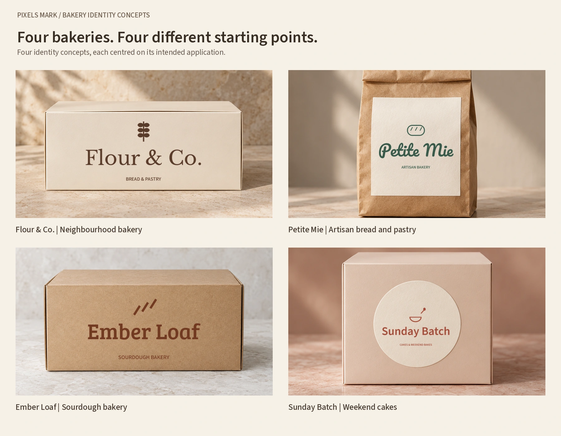
The four concepts below are original fictional working briefs. They are not client projects; names have not been trademark-cleared.
Flour & Co.: bread and pastry for a neighbourhood bakery
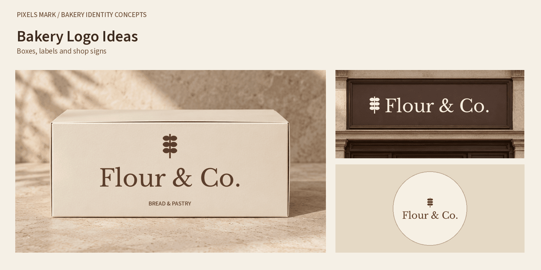
The brief for Flour & Co. calls for a serif wordmark with a restrained grain detail, proposed for a pastry-box panel, a round closure seal and a wide shop fascia. The concept targets an everyday neighbourhood bakery with a clear, readable identity across different print scales.
The box layout places the grain symbol above Flour & Co., with BREAD & PASTRY beneath the name. On the round seal, the descriptor is removed while the grain symbol and name lettering remain. This reduces the amount of text inside the circular area. The digital layout does not establish a suitable physical seal diameter.
The fascia changes the stacked arrangement into a horizontal one: the grain symbol sits beside the name, and the descriptor is omitted. The lettering and symbol are taken from the same master artwork. The light version is shown on a dark fascia; fabrication requirements still need confirmation from the sign supplier.
Next check: Confirm the actual print area and fold positions from the supplier dieline before finalising any box layout. Ask the sign fabricator what minimum stroke width their process holds reliably.
Petite Mie: bakery name and product name on a label
Petite Mie is an artisan bread and pastry concept. The brief calls for a script-led name and a restrained bread detail. The proposed primary application is a bread-bag label.
A bread-bag label typically carries two names: the bakery name and the product name. How their visual hierarchy should be arranged depends on the business. A bakery-led layout gives the bakery name the larger, more prominent position; a product-led layout puts the product name first, with the bakery name as a secondary identifier. Either is valid; the decision belongs in the brief, not in a general rule about which name is usually larger.
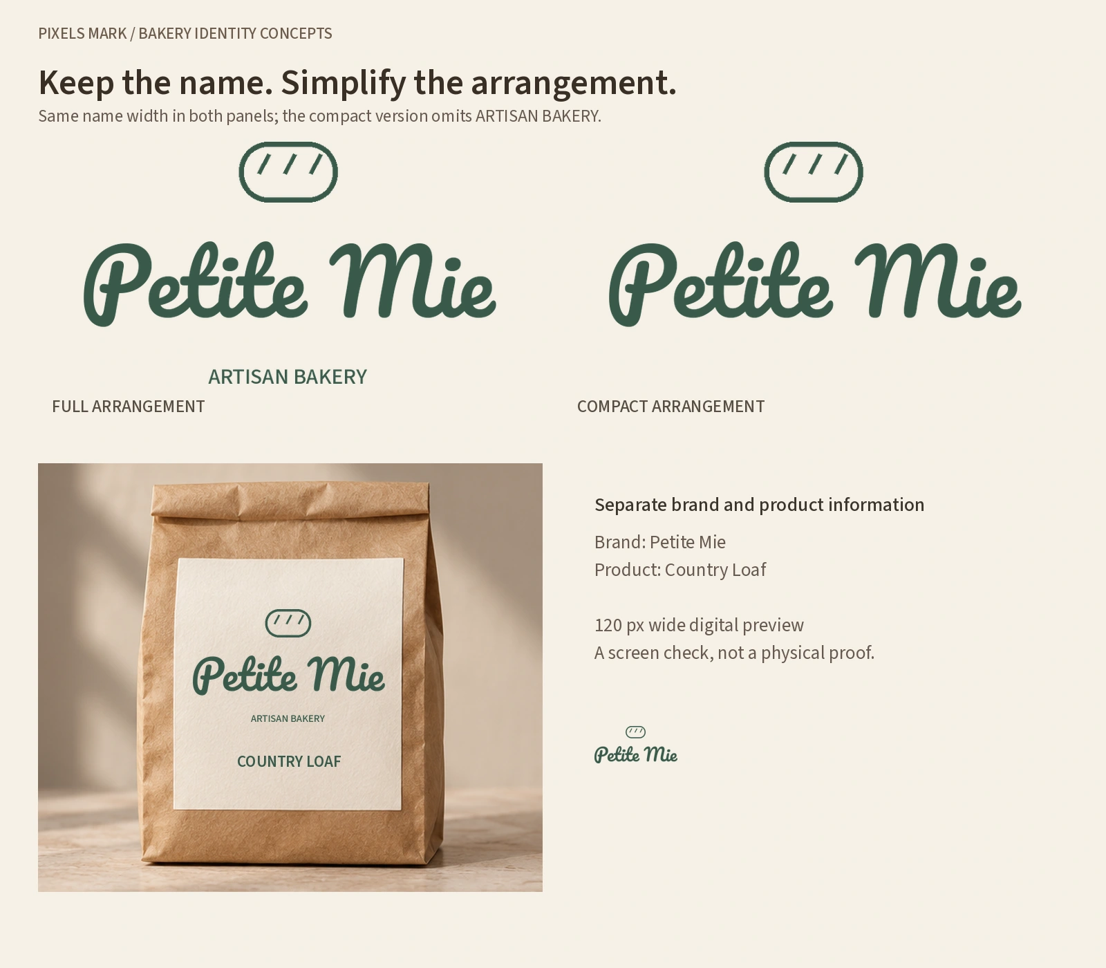
In the bread-bag example, Petite Mie is the main name, ARTISAN BAKERY is a smaller supporting descriptor and COUNTRY LOAF appears separately lower on the label. This establishes a bakery-led hierarchy for this example. A product-led retail range could use a different order. The mockup does not establish a physical label size.
The compact version removes ARTISAN BAKERY while retaining the same script lettering and bread symbol. It therefore contains less information and occupies a shallower area. The revised comparison keeps the name lettering at the same displayed width and aligns its position in both panels. Removing the descriptor shortens the complete arrangement; it does not change the name lettering. This is a construction comparison, not a reader study. A separate 120 px wide export provides a digital preview. That pixel width is a comparison setting, not a label specification. An initials-only mark would remove the full bakery name, but no initials version is shown here.
Next check: Confirm the label template and print-safe margins with the specific supplier you are using. Label requirements vary by product and print process.
Ember Loaf: a sourdough identity in one colour
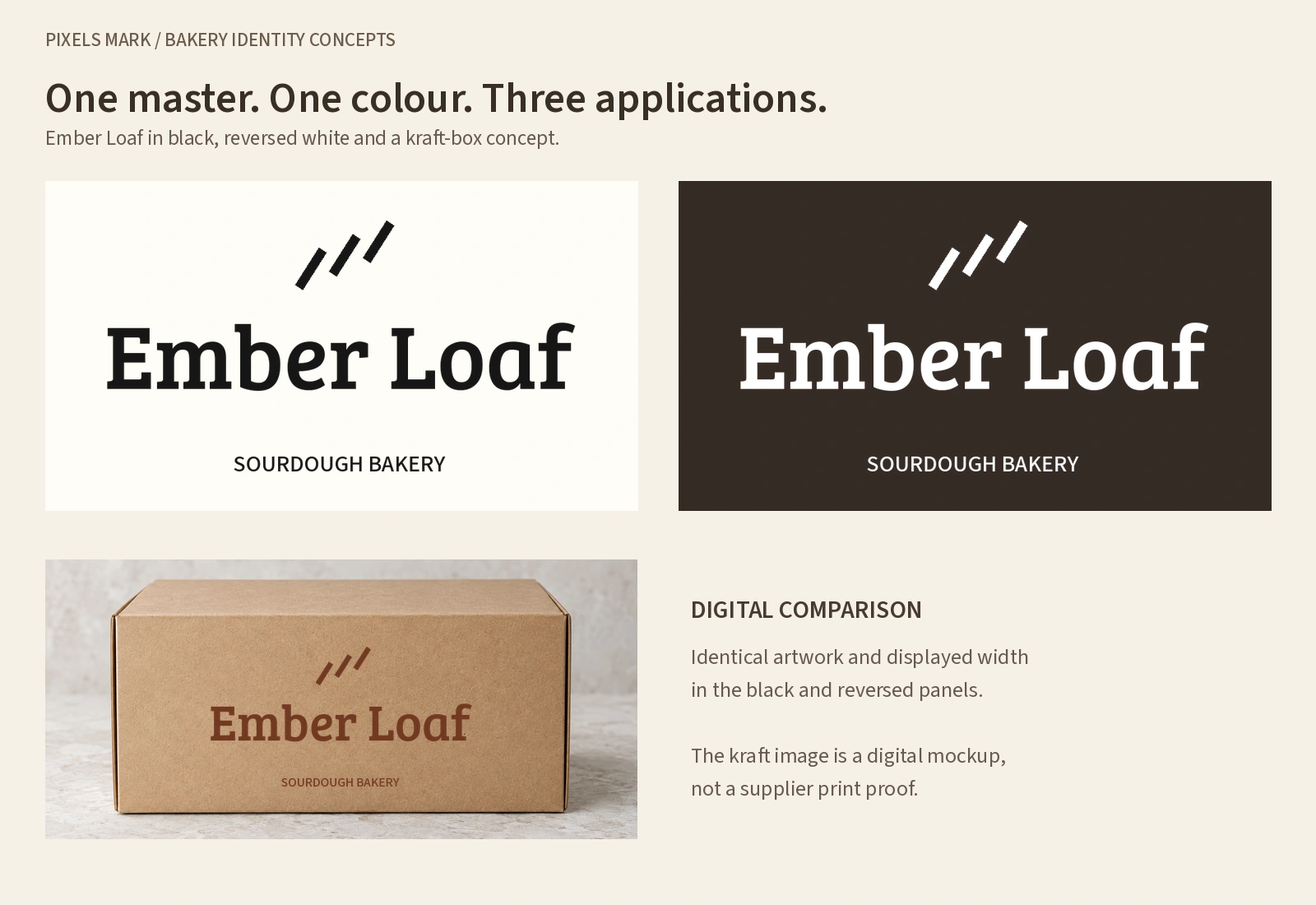
Ember Loaf is a sourdough-led bakery. The brief calls for a robust serif and an abstract bread-scoring detail. The proposed applications are a kraft pastry box with flat one-colour artwork, plus black-on-light and white-on-dark exports from the same master.
The black-on-light and white-on-dark panels use the same Ember Loaf artwork at the same displayed width. The three robust scoring strokes remain visibly separate in both digital versions. The kraft-box mockup uses the coloured master at a smaller scale. These are digital observations, not evidence of ink behaviour, substrate appearance or durability in production.
Next check: Ask the box supplier whether they require vector artwork, their minimum stroke-width requirement for the printing process, and whether a pre-production sample is available before a full run.
Sunday Batch: a cake-box sticker with two name levels
Sunday Batch is a weekend and home-bakery cake concept. Its rounded sans-serif name sits below a bowl-and-spoon symbol on a round cake-box sticker. CAKES & WEEKEND BAKES is a smaller business descriptor beneath the name. The image shows a bakery identity sticker, not a complete product label with ingredients or other required information.
The name and supporting descriptor use different sizes in the sticker example. At a smaller physical diameter, the descriptor may need more space or a simpler arrangement. Confirm the actual sticker dimensions and review a proof before deciding whether to retain it. No physical sticker test has been performed.
A window-sign application has been proposed for this concept. Until an approved and inspected version is available, this remains a proposed check rather than a finding.
Next check: Confirm the sticker dimensions and usable print area from the supplier template before finalising the layout.
One Bakery Identity Across a Box, Seal and Sign
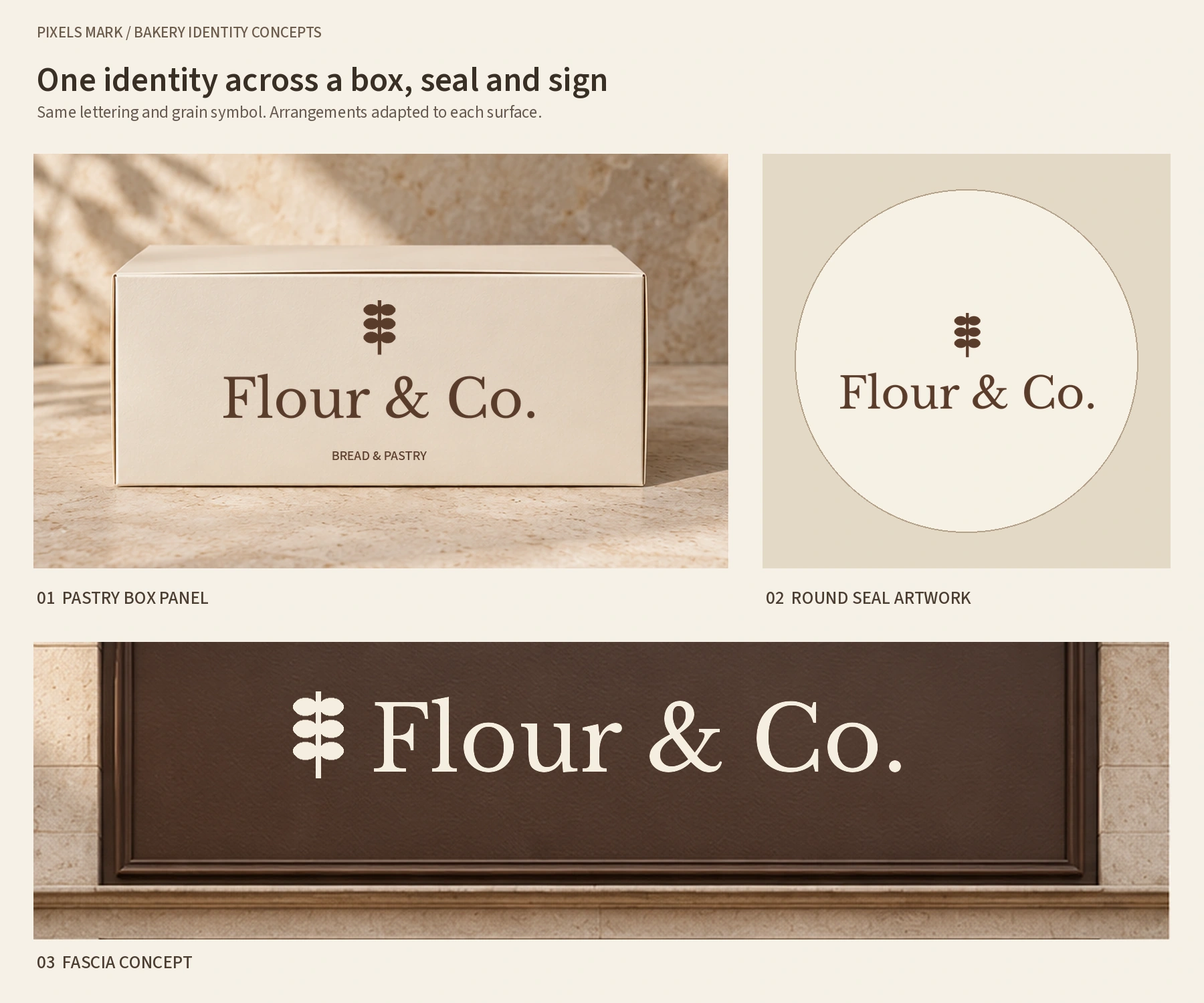
Flour & Co. shows what stays consistent across three applications: the serif name lettering, the grain symbol and the brown-and-cream palette. The box uses a stacked full arrangement, the round seal omits the descriptor and the fascia places the symbol beside the name. These are deliberate layout changes within one identity.
A pastry-box panel and a round closure seal are different briefs even when they carry the same identity. The box mockup shows a larger rectangular area; the seal is shown separately as flat circular artwork. It is not attached across a box fold in this illustration. If your supplier intends the seal to cross a closure, confirm the fold position and keep critical lettering away from any crease that could obscure it. That decision depends on the chosen box construction and seal diameter.
Confirming the layout for any of these surfaces requires the supplier template for that product. The template establishes the usable print area, any safe-area margins and the fold or window positions. A template from a different supplier or a different product is not a substitute for the one that applies to your chosen item.
Surface, constraint and supplier questions
| Surface | Potential issue | Arrangement to consider | Supplier question |
|---|---|---|---|
| Pastry box panel | Bakery name and descriptor at the same size; hierarchy unclear | Set descriptor at a clearly smaller or lighter weight | Confirm the usable print area and bleed from the supplier dieline |
| Round closure seal | Round format and fold position may conflict with letterforms | Check fold position in the dieline; keep critical lettering clear of it | Confirm the seal diameter and fold position for the actual product |
| Bread-bag label | Bakery name and product name at the same scale; neither reads as primary | Decide which name should lead and set a clear size or weight distinction | Confirm the label template and print-safe margins for your supplier |
| Shop fascia | Fine mark elements may not hold at the fabrication method used | Ask the fabricator for the minimum stroke width their process holds reliably | Request a minimum stroke specification and whether a pre-production proof is available |
| One-colour (mono) | Elements that rely on colour contrast to separate may become illegible | Inspect the one-colour and reversed exports from the confirmed master | Ask whether the printer needs a vector source and what file format they accept |
| Cake-box sticker | Two name levels at similar sizes; neither reads as primary identifier | Confirm dimensions first; then set levels with a clear size or weight distinction | Request the supplier template and the usable print area for the intended sticker size |
Choosing a design route
Once you know which surfaces you need to cover first, the brief becomes easier to scope. A bakery that needs a box panel and a seal has different requirements from one that needs a bread-bag label with a deliberate name hierarchy and a shop fascia. Starting with one surface and expanding is workable, but compact and mono versions designed together from the start tend to be more consistent than ones added later.
The three questions that matter most before briefing a designer are: which surfaces are needed now and which can follow; whether a compact or mono variation is required as part of the initial scope; and whether you have a supplier template for any of the physical applications. A suitable template is one important input; accepted file format, artwork construction, effective resolution where relevant, colour setup and supplier review also shape whether an artwork file is usable for print. The template tells you the dimensions and safe areas to design within.
For a broader view of what affects a designer quote, the logo design cost guide covers scope, revision rounds and format deliverables.
Copyable enquiry brief
Copy the fields below and complete them before contacting a designer. Write To confirm for anything you cannot confirm yet.
Bakery name:
Product focus (bread, pastry, cake, mixed):
Target customer and main use:
Required surfaces (list all):
Exact logo and descriptor text:
Existing assets (colours, fonts, previous mark):
Supplier templates held or needed:
Launch date or timing:
Budget range:
Requested deliverables (variations, formats, source files):
Questions
Does a bakery logo need wheat, bread or pastry imagery?
No. Literal product imagery is common in bakery branding, which can make differentiation harder rather than easier. The four concepts above each use a restrained single detail tied to the specific brief. What the mark needs to do is work clearly at the sizes and surfaces the business actually uses. Whether that involves a food reference depends on the brief.
Which logo variation belongs on a small seal?
It depends on the actual diameter of the seal you are using and on the fold position in the dieline. A seal may carry a full name, a name-only version or a simplified mark, depending on how much space is genuinely available and whether text needs to stay clear of a fold. The arrangement belongs in the original brief rather than being added later as a separate task.
Can a bakery name and a product name share a label?
Yes. The two need to be visually distinct so that a customer scanning a shelf can read them separately. Whether the bakery name or the product name should carry more visual weight depends on the business and the label. Confirming the label dimensions with the supplier before finalising the layout determines how much space is genuinely available for each level.
Which files should I confirm with a printer before submitting?
Ask for the artwork template for the specific product you are using and confirm the accepted file formats, any bleed requirements and the colour profile. Many label and sign suppliers require a vector source file. For a practical overview of when vector and raster formats each apply, the PNG vs SVG vs JPG guide covers the differences.
Next steps
If you are ready to discuss a bakery logo, bring your name, your first two applications and any supplier templates you already have. A designer can confirm scope, variations and format deliverables from that starting point.
Discuss Your Bakery LogoFor simpler DIY needs: Explore the Bakery Logo Maker.
Sources and Methodology
Manufacturing references used:
noissue Custom Cake and Pastry Box: real product material and print options, not a universal box specification. Checked October 2026.
noissue Product Size Diagrams Index: size reference, not an artwork-safe-area template. Checked October 2026.
Avery artwork guidelines: product-specific label artwork reference. Checked October 2026.
Avery downloadable label templates: product-specific roll-label templates. Checked October 2026.
Fictional concepts: Flour & Co., Petite Mie, Ember Loaf and Sunday Batch are original fictional working briefs created for this article. No real business name, client outcome or revenue is implied. Names have not been trademark-cleared.
Font licence references: Libre Baskerville, Pacifico, Bree Serif and Source Sans 3 are distributed under the SIL Open Font License. Check the licence supplied with the actual font files used. Record the file version and weight during production. Font licensing does not establish clearance for a brand name.
Visual method: the four fictional identities were typeset with actual font files and reused as the same master artwork across the illustrations. Text-free packaging and shop backgrounds were AI-generated, then the logos were composited separately. The compact sheet includes a 120 px wide digital export; its appearance within a responsive page is not a fixed physical-size test. Digital illustrations are not supplier-approved artwork or physical proofs.