
Author
Pixels Mark
Release
Intensity
13 MIN READ
A skincare logo works differently from a salon or clinic identity. It needs to hold up on a 30 ml bottle, read clearly across a jar lid and carton face, and stay recognisable in the small product images that appear on retail and marketplace listings. Choosing a direction means understanding how each design element behaves when space runs out.
This article works through six original fictional directions, each with a brief and a packaging application. It then covers two practical checks: how a long brand name changes the layout, and what a logo looks like when colour is removed.
Explore skincare logo directions with your own brand name and palette.
Six Skincare Logo Directions for Product Brands
Each direction below starts with a brief, the positioning the founder wants to communicate, then describes the mark, proposed typeface references and palette, and explains the key packaging decision that follows from those choices. A comparison table and editorial image follow the six descriptions.
1. Clinical: VEK / VEK DAILY SKINCARE
Brief: a product line wanting the clarity and precision associated with clinical formulation, without implying medical authority or regulatory approval. The founder wanted the identity to feel rigorous rather than cold.
VEK proposes Inter SemiBold with a squared V construction as its mark. Navy (#203047) and white keep the palette tight. The full-name variant, VEK DAILY SKINCARE, is planned with the same typeface at a reduced weight for the descriptor, which keeps the hierarchy clear without adding a second typeface. In the pictured concept, the V mark sits above a horizontal VEK wordmark on the bottle, jar and carton. The longer name remains a proposed variation to check separately on the actual label dimensions.
The key discipline here is restraint. A medical cross or any approval-adjacent symbol is off the table. The identity earns its clinical feel through structure and spacing, not borrowed authority.
2. Botanical: MOSSEN / MOSSEN FIELD BOTANICALS
Brief: an ingredient-forward line wanting to connect with natural sourcing without making certification claims the brand cannot support.
MOSSEN pairs a branching leaf symbol with a serif wordmark in the pictured concept. Forest green and warm cream carry the palette, with Lora SemiBold proposed as a typeface reference. The leaf symbol sits above the name on the bottle, jar and carton. Before adapting this direction to a small label or jar lid, check whether the leaves stay distinct at the intended print size and whether the wordmark remains readable.
The distinction between a botanical aesthetic and an organic claim matters practically as well as legally. The identity communicates what inspires the formulation; it makes no statement about certification or ingredient sourcing that the label copy cannot support.
3. Minimalist: OROVE / OROVE EVERYDAY SKINCARE
Brief: a founder wanting a quiet, contemporary identity that does not reference any particular ingredient category or clinical positioning. The brand should feel considered rather than premium.
OROVE uses an open O and a spaced wordmark as its main visual features. Inter Medium remains a proposed typeface reference, not a verified match for the generated lettering. Charcoal (#242424) and warm grey (#E9E5DF) are the planned palette. The long name, OROVE EVERYDAY SKINCARE, is designed with a defined stacked lockup: OROVE large, with EVERYDAY SKINCARE on a smaller line below and spaced lettering. This lockup is planned before layout rather than improvised from size-reduction.
Minimalist identities depend on spacing doing the work that illustration does elsewhere. A crowded version of a minimal logo reads as incomplete, not restrained. The stacked lockup is one way to protect legibility on a narrow label without requiring a condensed typeface or a symbol to anchor the composition.
4. Sensitive-Skin Positioning: SONA / SONA EVERYDAY SKINCARE
Brief: a fictional skincare identity exploring a reassuring, readable visual style, without suitability or hypoallergenic claims.
SONA proposes Nunito Sans SemiBold with a rounded open arch as the mark. Plum (#503D52) and pale lilac (#EEE8F0) are the planned palette. The palette is intended to read as gentle; the proposed type choice and spacing reinforce that tone. SONA is a fictional branding brief, not a formulated or tested product. The colour choices suggest a positioning; they do not demonstrate gentleness, safety or certification. Regulatory guidance in most markets distinguishes what a cosmetic label may claim from what it may imply, and neither the mark nor the palette makes a claim the label copy cannot support.
On a jar lid, the rounded arch mark is worth considering at reduced size. Whether a symbol or a wordmark works better depends on the specific lid dimensions and how the mark reads at that scale. Check both before deciding.
5. Luxury: VELUNE / VELUNE HOUSE OF SKINCARE
Brief: a founder positioning the line in the prestige segment, where the identity needs to hold up in contexts where packaging finish (foil, embossing, matte lacquer) is part of the brand experience.
VELUNE proposes DM Serif Display with a compact V monogram. Oxblood (#502732) and ivory (#F4EEE5) are the planned palette. The direction depends on strong typography and generous spacing rather than graphic complexity, which means the proposed mono version is intended to carry similar weight to the full-colour version. This matters practically: luxury packaging often involves processes where colour is absent or reduced. Check the identity in one colour before choosing production finishes.
Optional finish decisions (foil, embossing) are production choices made with a supplier. The identity should be designed so the mono mark stands alone before those decisions are taken.
6. Playful: PIPPO / PIPPO DAILY SKINCARE
Brief: a line aimed at customers who find most skincare branding overly serious. The founder wanted colour and energy without the identity reading as children's packaging or food.
PIPPO proposes Nunito Sans ExtraBold with an offset paired-circle mark. Cobalt (#2349D9) and apricot (#F5B38D) are the planned palette. The circle mark is proposed as bold enough to consider for a jar lid at reduced size. The long name, PIPPO DAILY SKINCARE, is planned with the same ExtraBold weight throughout, which is intended to keep the energy consistent rather than shifting tone with a lighter descriptor.
The risk with a playful direction is slipping into aesthetics associated with a different product category. The brief specifically avoids candy or food-shaped packaging associations. The cobalt and apricot palette is energetic without reading as edible, and the mark is geometric rather than character-based.
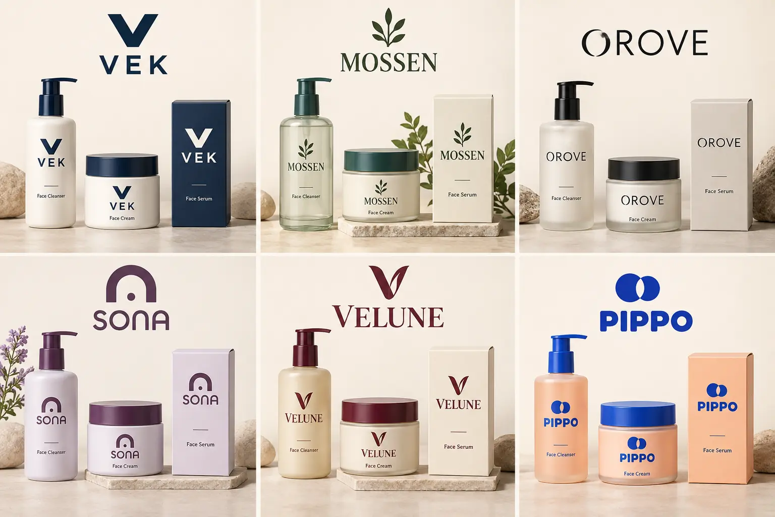
| Direction | Mark type | Proposed typeface reference | Palette | Jar lid consideration | Long-name handling |
|---|---|---|---|---|---|
| Clinical (VEK) | Squared lettermark | Inter SemiBold | Navy, white | V mark or horizontal wordmark | Descriptor at reduced weight below |
| Botanical (MOSSEN) | Branching leaf symbol + serif wordmark | Lora SemiBold | Forest green, cream | Check the leaf symbol and wordmark at actual lid size | Proposed FIELD BOTANICALS descriptor below; check spacing on the actual label |
| Minimalist (OROVE) | Spaced wordmark | Inter Medium | Charcoal, warm grey | O mark or stacked lockup | Defined stacked lockup; no additional typeface |
| Sensitive (SONA) | Rounded arch mark + wordmark | Nunito Sans SemiBold | Plum, pale lilac | Arch mark at reduced size; check legibility at actual lid dimensions | Descriptor at same weight; generous spacing |
| Luxury (VELUNE) | Serif monogram + wordmark | DM Serif Display | Oxblood, ivory | V monogram | House of Skincare tracked, generous leading |
| Playful (PIPPO) | Paired-circle mark + wordmark | Nunito Sans ExtraBold | Cobalt, apricot | Circle mark at reduced size | Full ExtraBold throughout; no weight shift |
Make the Name Fit the Bottle, Jar and Carton
Name length is one of the most practical constraints in skincare packaging. A short name like VEK fits a narrow bottle at a reasonable size. MOSSEN FIELD BOTANICALS is a different problem: three words across a 30 ml bottle face require a planned layout, not a proportional reduction of the full wordmark. Reducing everything proportionally until it fits produces a wordmark that is technically present but difficult to read at label size.
Separate the main brand name from the supporting words before adapting the logo to a narrow label. In the OROVE comparison below, EVERYDAY SKINCARE sits on a smaller line beneath OROVE, keeping the brand name dominant. The other long-name variants above are proposed extensions, not additional packaging examples shown in the images. For your own brand, compare a stacked lockup, a smaller descriptor and an abbreviated mark using the actual container dimensions.
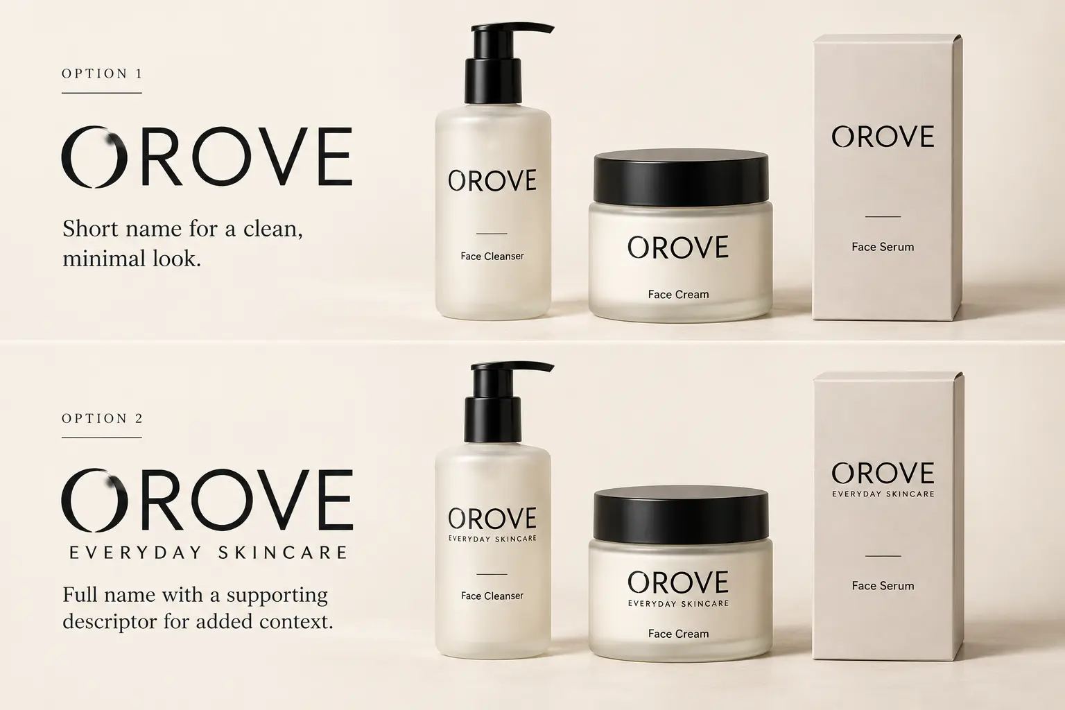
The separation between brand name and product name is a related decision. On many skincare labels, the brand name and the product name occupy different hierarchy levels: the brand name leads, the product name (Face Cleanser, Face Cream) sits below. Treating the product name as part of the logo wordmark is not the only option; keeping them as separate copy elements gives the brand more flexibility as the product range grows.
Check the Logo in One Colour and at Small Sizes
Colour carries a lot of work in each direction above. Remove it, and the identity needs to hold up on structural terms: mark clarity, type legibility and overall balance. A one-colour test is worth running before committing to final artwork, because it reveals whether the design depends on the palette or whether it stands alone.
The useful checks are consistent across directions: does the mark read clearly in black on white? Does it hold up reversed in white on a dark ground? If the mark loses definition or the letterforms blur when colour is removed, the identity may be relying on the palette to do structural work.
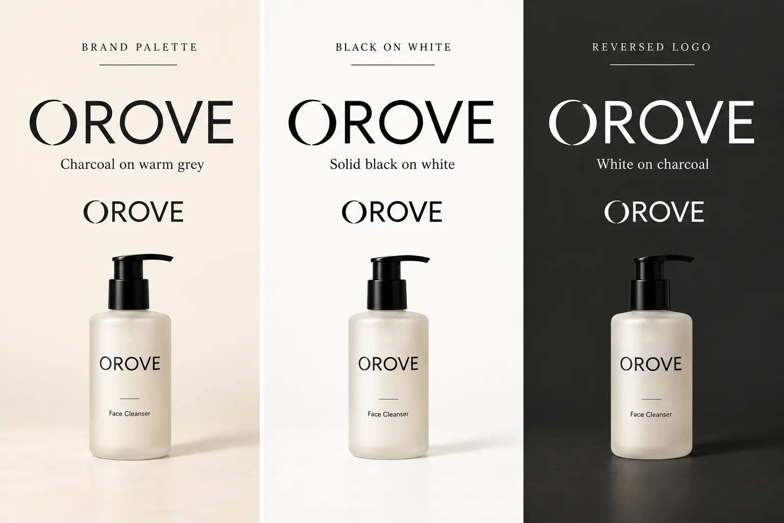
A small-size preview works the same way. The useful check is whether the mark and wordmark remain distinct at the size they appear in a product listing image. This is one inspection point, not a retailer specification, and the right comparison size will vary by platform and device.
Prepare a Useful Brief for Your Label Printer or Designer
Choosing a direction is the first step. Getting the artwork to a label printer or a logo designer is a different task, and the gap between the two catches many founders out.
A label printer needs the final label dimensions, which come from the actual container, not an estimate. Most specialist label printers provide a template or dieline for their supported formats; this is the document that establishes the print area, bleed, safe zone and any fold or cut. Your artwork needs to be built to that template, not resized after the fact. File format, colour mode and resolution requirements vary by supplier; your specific printer's requirements take precedence. For the file types to request and prepare, the Pixels Mark logo file format guide covers the practical differences between vector and raster files and when each is needed.
Required label copy, including ingredient list, net weight, responsible person details and country-specific regulatory information, is separate from logo artwork. Knowing how much space the required copy will take before finalising the logo size and hierarchy prevents the situation where the logo needs to shrink to accommodate mandatory text. Jurisdiction requirements differ: US FDA guidance, Great Britain cosmetics regulations, Canada's labelling requirements and Australia's mandatory standard each specify what must appear and in what form.
If you are working with a custom logo designer, a useful brief includes the container dimensions and template, the required copy with its minimum readable size, any finish preferences the supplier supports, and the packaging formats the identity needs to cover. A designer who understands the print context from the start will make different decisions than one working from a visual brief alone. If cost and scope are factors in that decision, the logo design cost guide covers what affects a quote.
Choose Your Next Step
If you have a clear sense of direction from the six concepts above and want to explore how your brand name and palette work together, the Pixels Mark skincare logo maker lets you try a direction with your own name. If your packaging needs distinctive custom marks, a carefully adapted lockup across multiple container formats, or a brief that involves unusual print constraints, a custom design conversation is the more practical route.
Try the logo maker
Explore skincare logo directions with your own brand name and palette.
Create Your Skincare Logo FreeNeed a custom mark?
If your packaging needs a distinctive identity adapted across multiple formats, discuss your brief with the Pixels Mark design team.
Get Custom Logo Design HelpCommon Questions
Can a long brand name work on a narrow skincare bottle?
Yes, but it requires a planned stacked or abbreviated lockup rather than a proportional reduction of the full wordmark. A long name set at full size across a narrow bottle label can fall below a readable print size. The more practical approach is to establish a compact version of the identity early, whether that is an abbreviated mark, a stacked layout or a symbol that works alone, before finalising artwork for production.
Does a skincare logo need a black-and-white version?
If you are considering any production finish where colour is absent or reduced, such as embossed packaging, foil blocking or single-colour print runs, then yes. A black-and-white version also reveals whether the identity holds up structurally or whether it depends on colour to feel complete. Running a mono test before committing to final artwork is straightforward and catches problems that are expensive to fix after production.
Should the wordmark or symbol lead on a jar lid?
It depends on the specific lid dimensions and how each element reads at that scale. A symbol or lettermark is often easier to place on a small circular surface, but a short wordmark can work if the type is set at a legible size. Check both versions at the actual lid dimensions before deciding, rather than assuming one approach will work without seeing it.
Sources and Methodology
The six skincare logo directions in this article are original fictional concepts developed for editorial demonstration. The brand names (VEK, MOSSEN, OROVE, SONA, VELUNE, PIPPO) and product identities are invented; they have not been checked for trademark availability. They are design concepts, not client projects or sale-ready labels.
The images are AI-generated design concepts, reviewed visually as digital mockups for this guide. The comparisons illustrate packaging layouts, name hierarchy and one-colour logo treatments. They are not physical print proofs, controlled reader tests or evidence of product performance. Final artwork should be checked at the intended size using your printer's specifications.
Competitor research reviewed ten relevant pages across eight domains including Selfnamed, Rixin Cosmetics, 99designs, DesignerPeople, Looka, Canva, Artifex Studio and Pentagram. They represent an observed editorial sample; the order does not reflect a verified ranking for any location or query.
Font licence references: Inter, Lora, DM Serif Display and Nunito Sans each have SIL Open Font License 1.1 files in the Google Fonts repository. Generated lettering does not verify which font was used; exact typeface identification and licence verification require the actual font files.